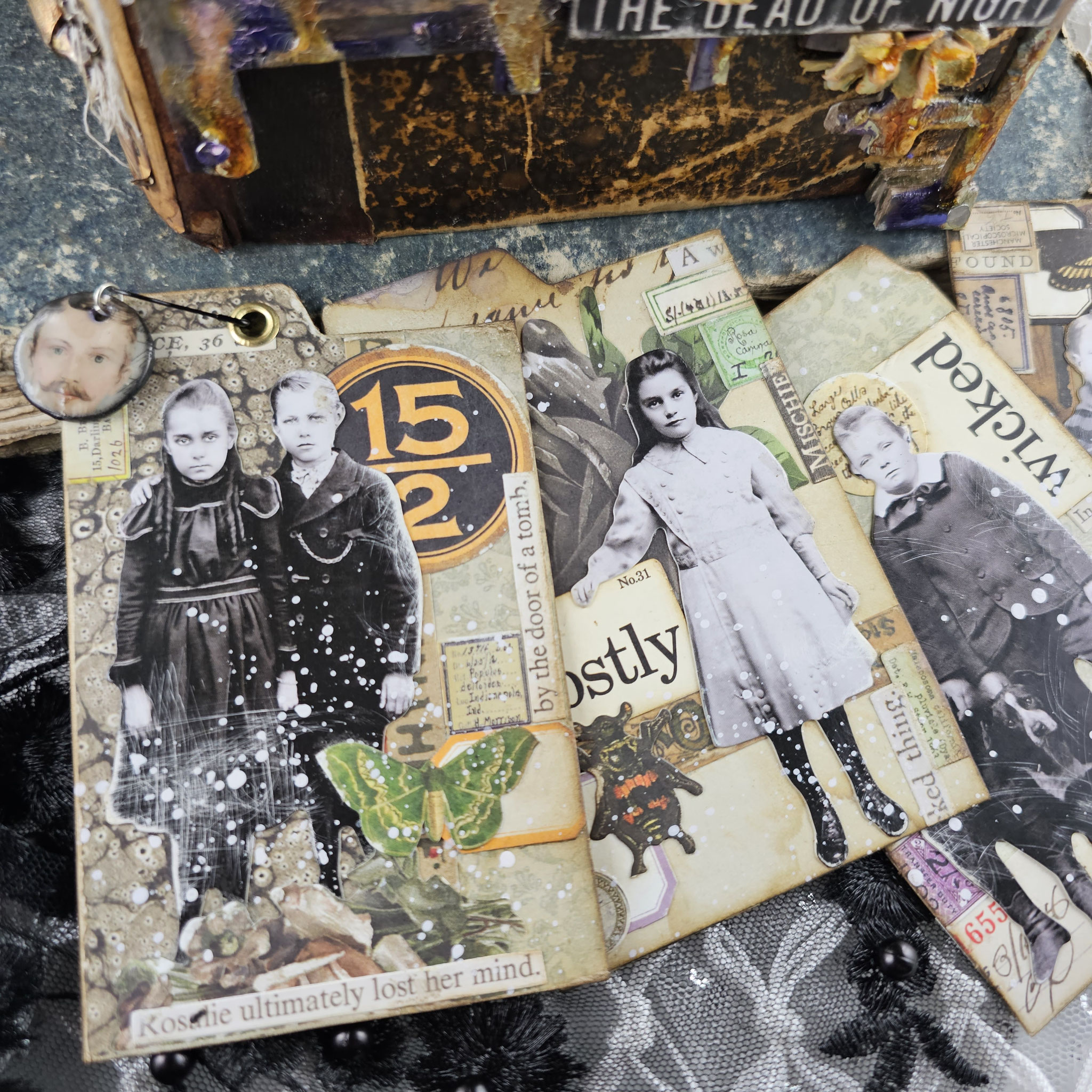
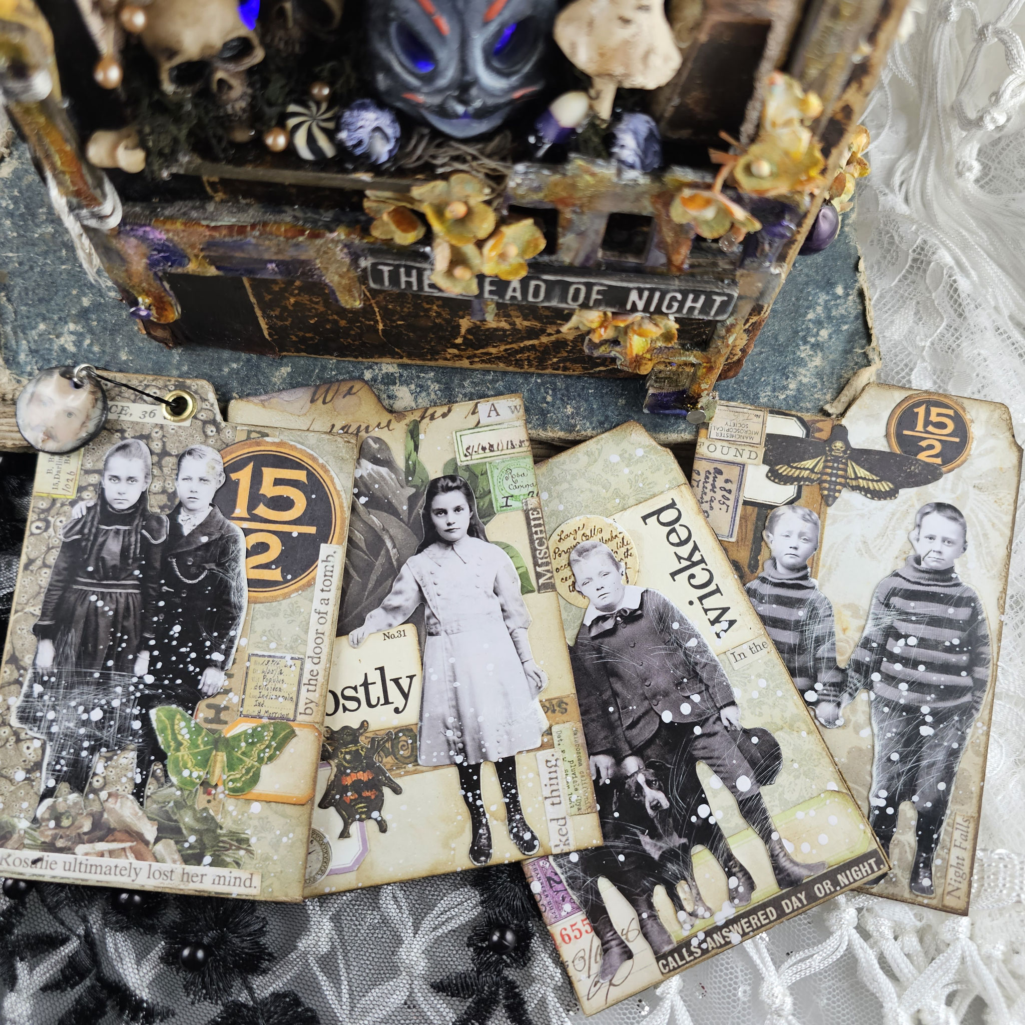
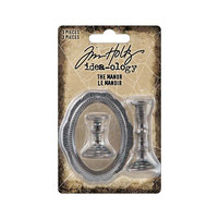
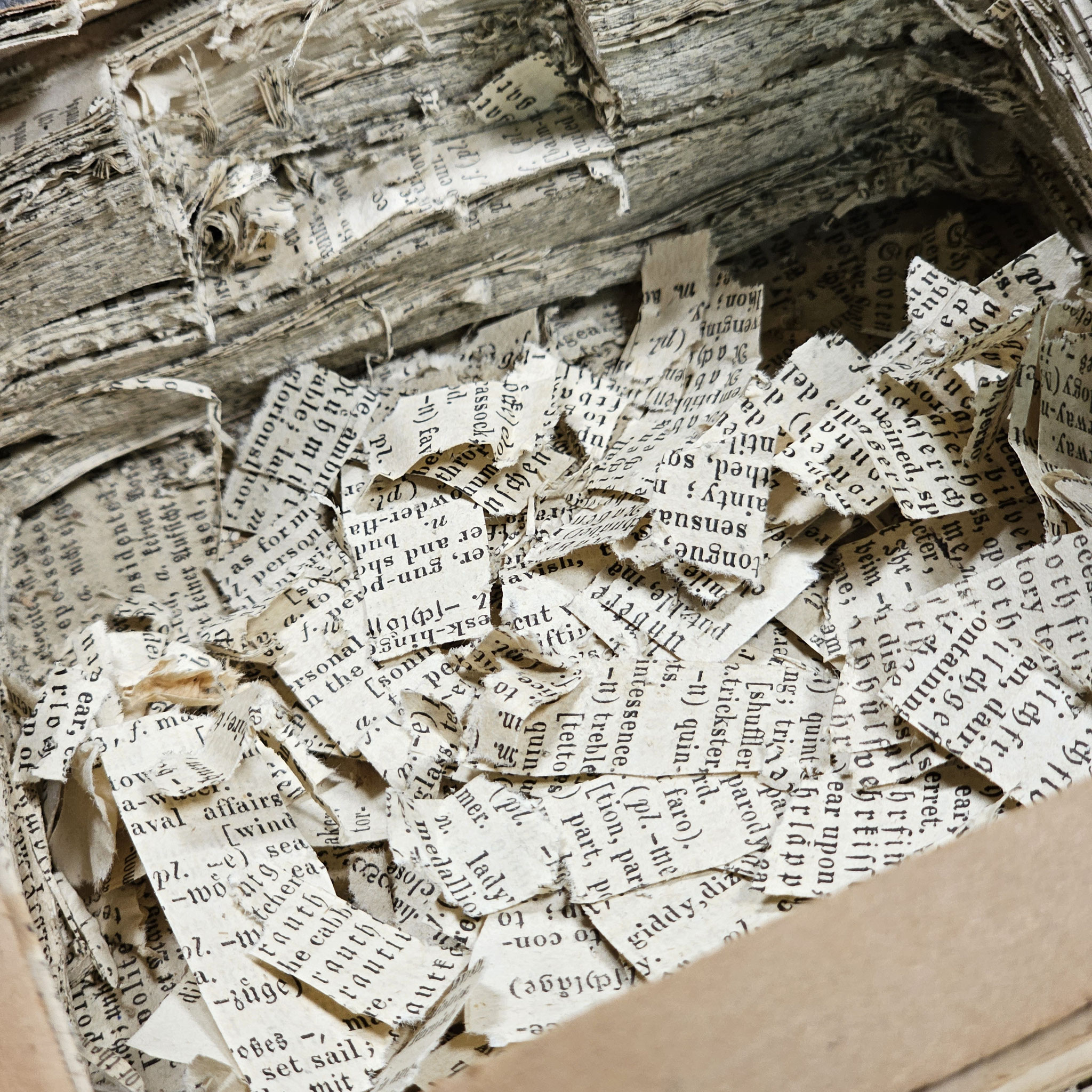
Today I wanna share my Halloween mini clipboard on a vintage book with you that I've created for the @tim_holtz IDEA-OLOGY HALLOWEEN 2023 release.
It all began with a mini clipboard, but as it often - and especially with idea-ology - happens, my creativity got the best of me, and the project escalated into something bigger. In this video, I'll show you how I built the entire structure and reveal some tricks on how to modify the amazing idea-ology pieces to create a unique Halloween look for your own projects.
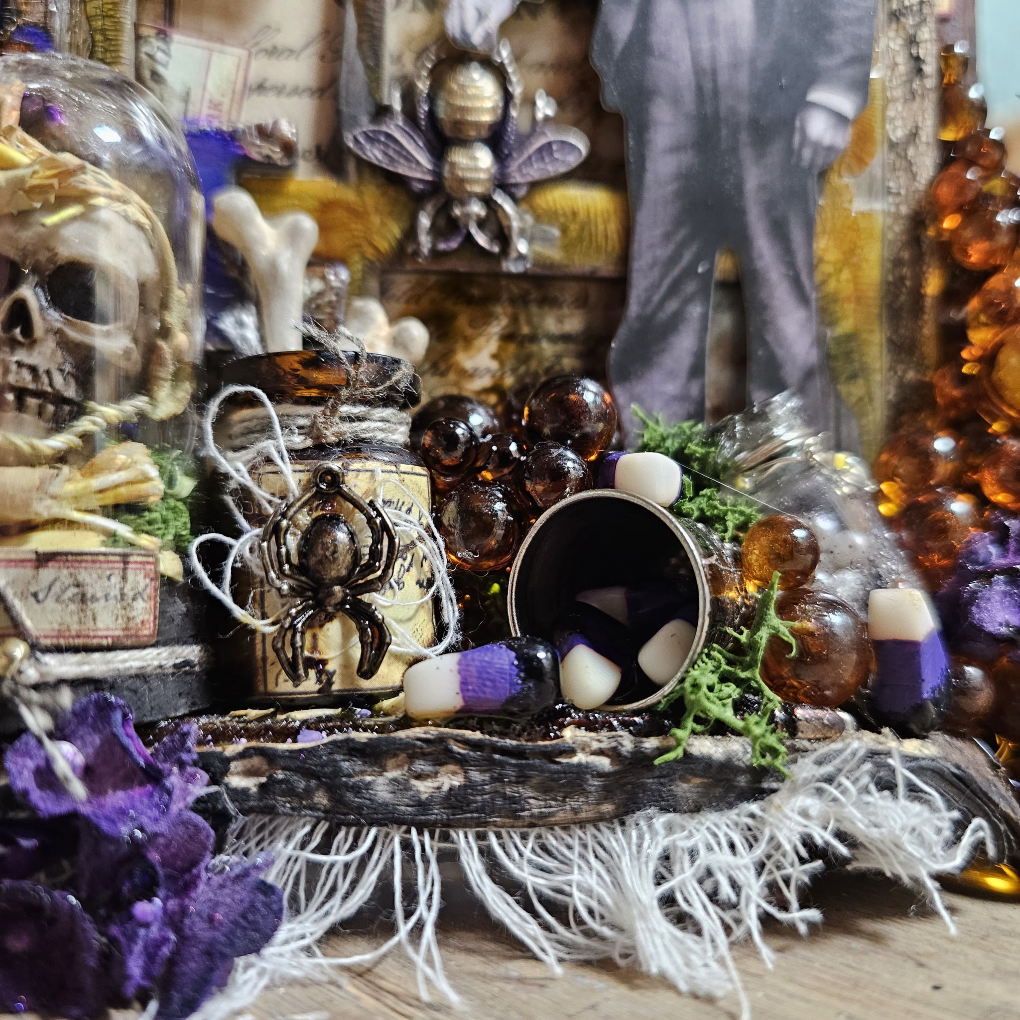
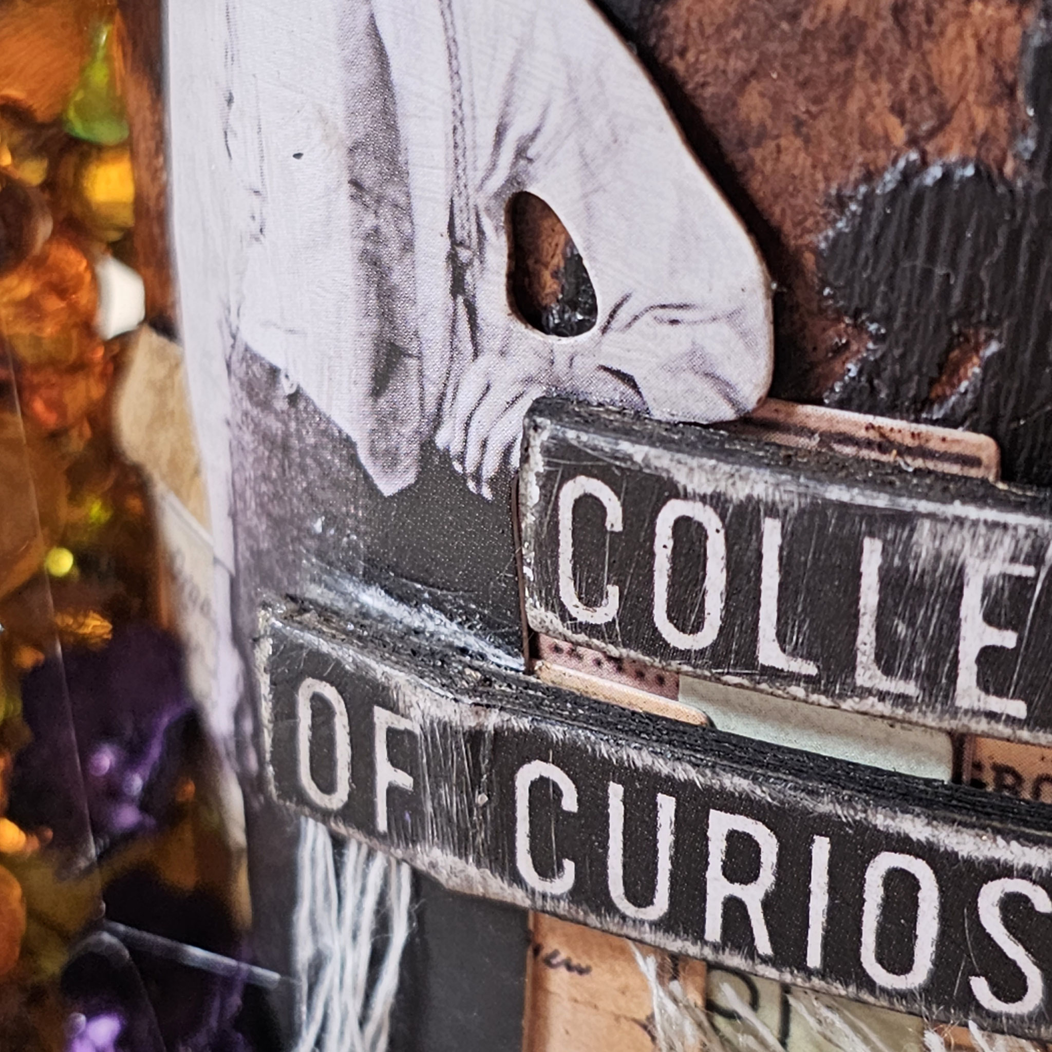
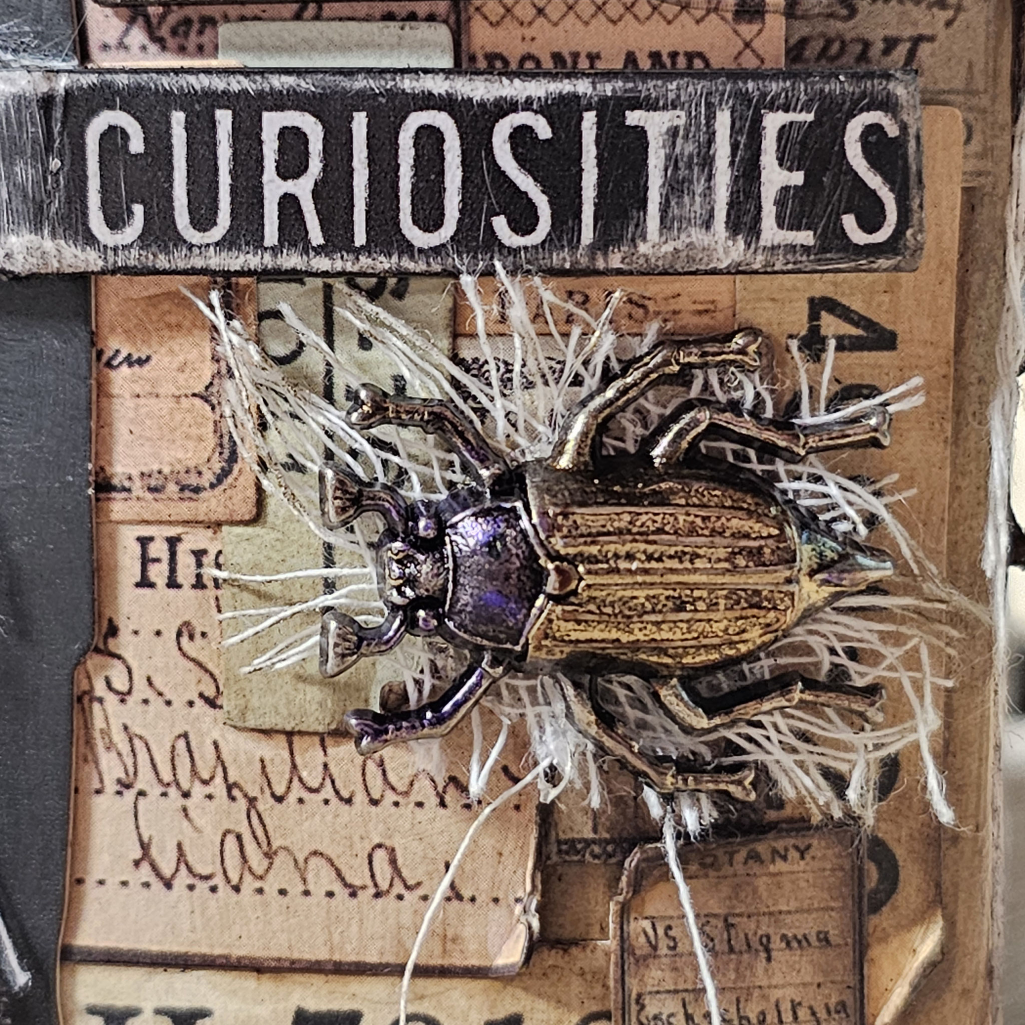
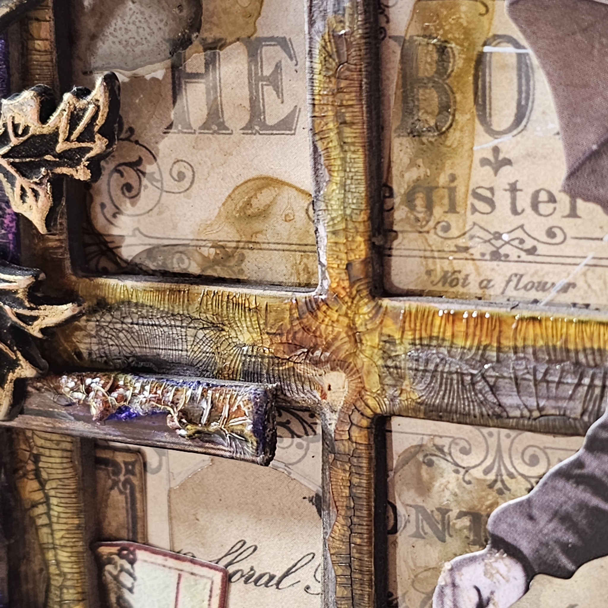
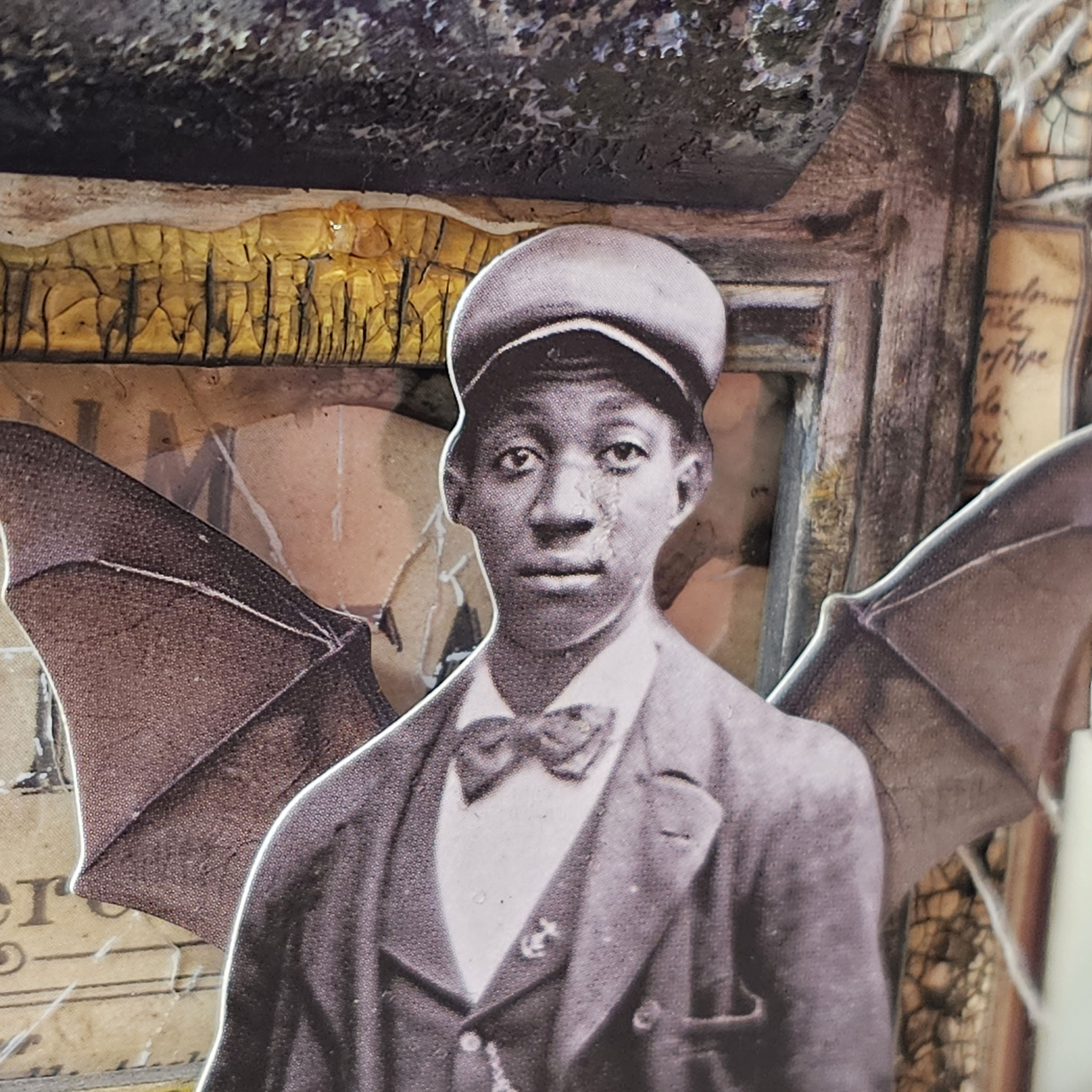
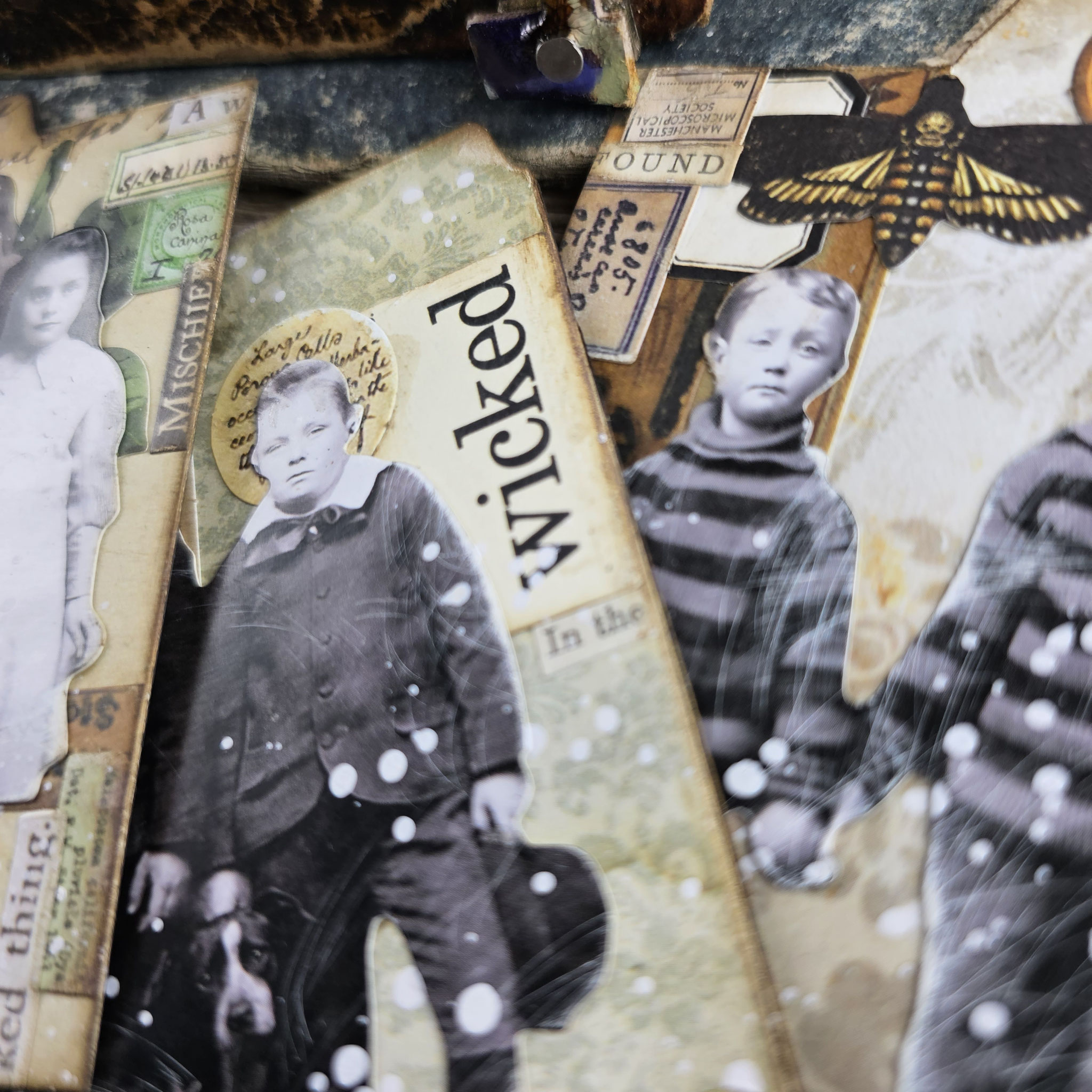
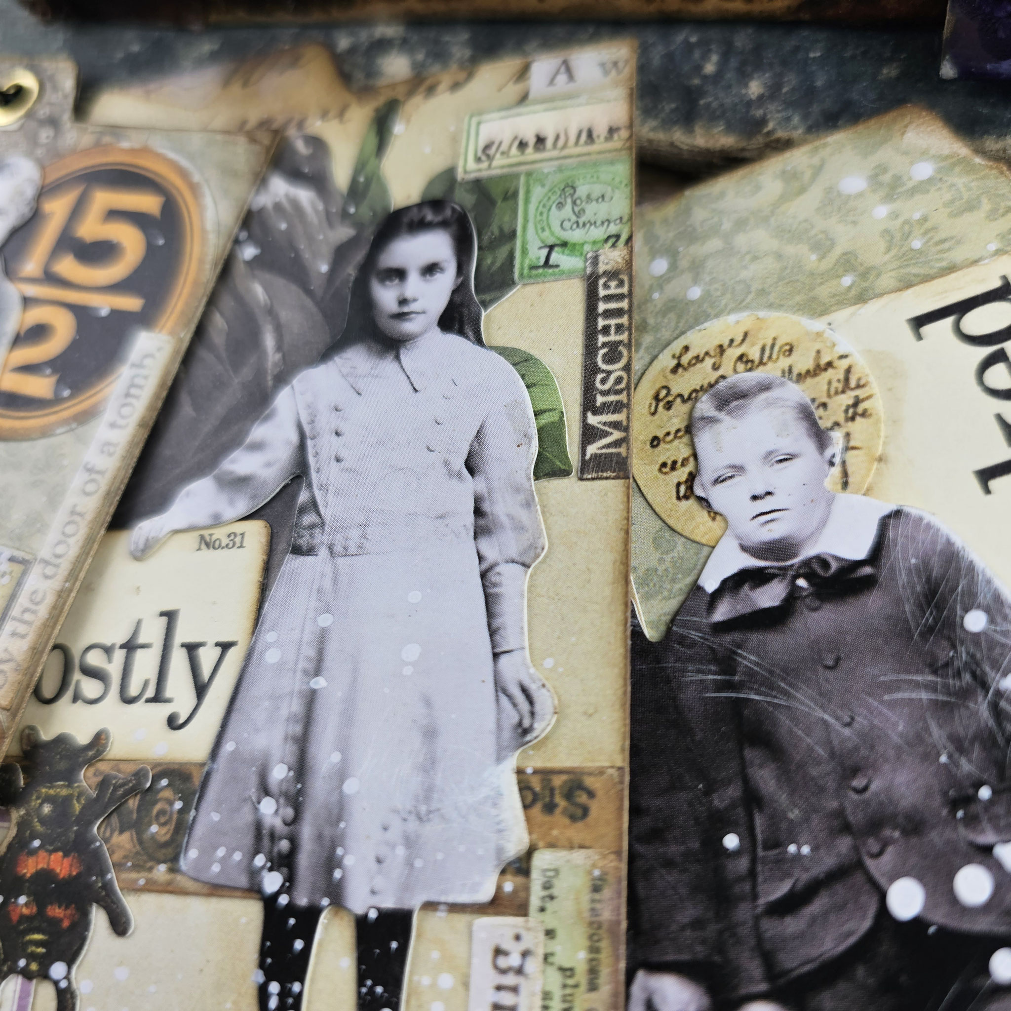
As promised in the video I share some photos with you, so that you can explore the details of this make.
These photos? They're like snapshots of the journey – the experimentation, the ideas clicking into place. It's all about breaking away from the norm and letting that creative energy flow.
Below each photo you can find the products used if you wanna grab them for your own stash! I am looking forward to see your creations! Let's dive into it and inspire each other with the endless possibilities of idea-ology!
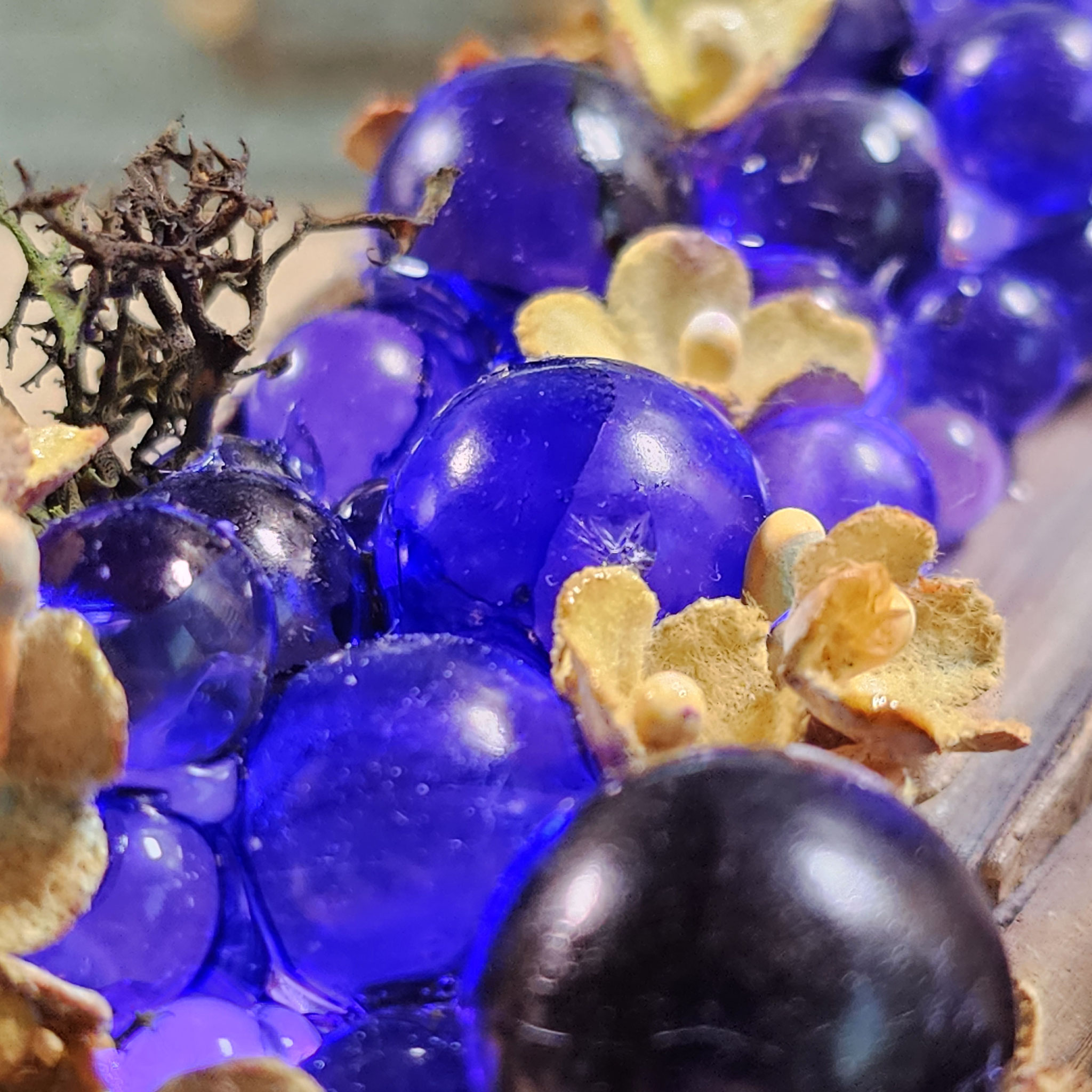
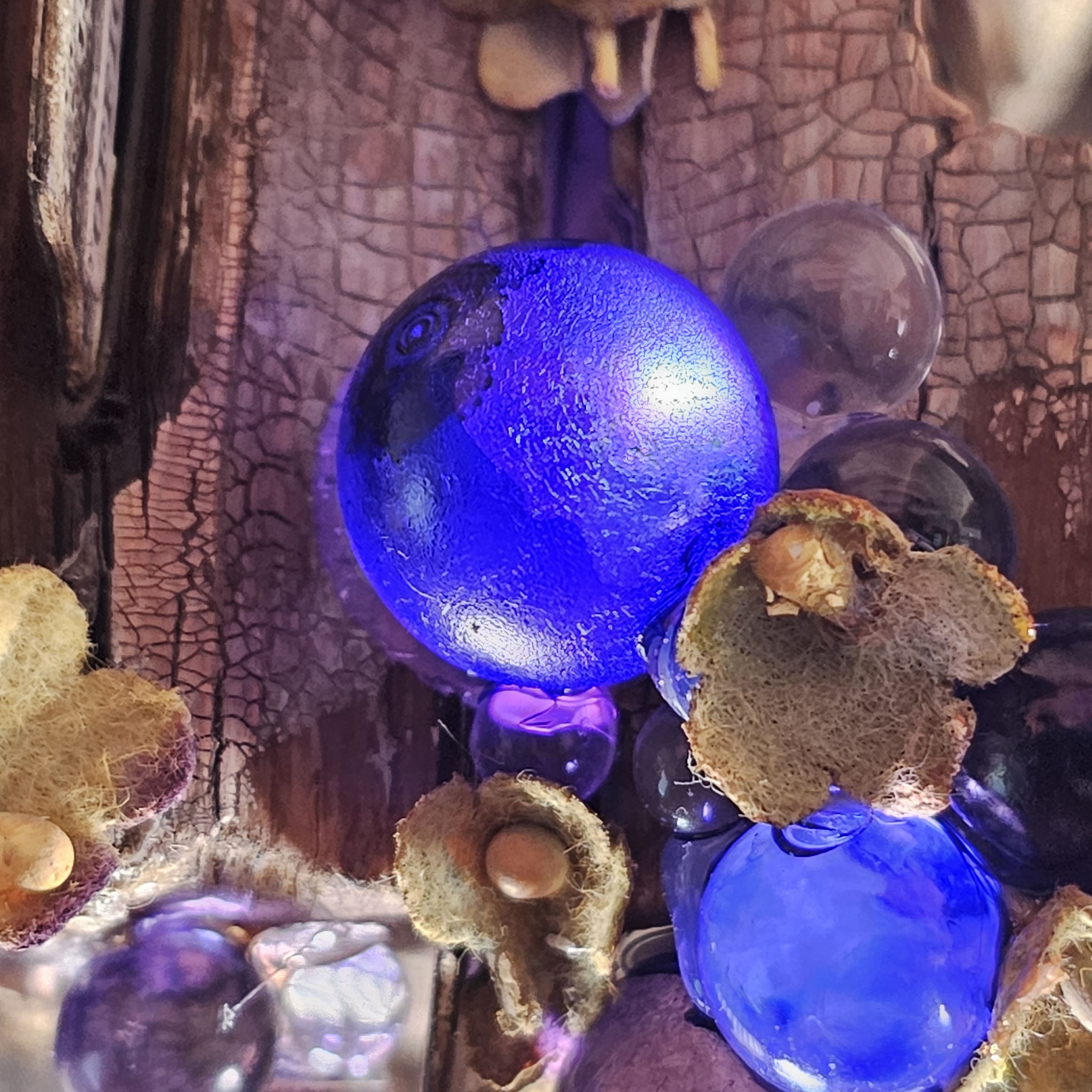
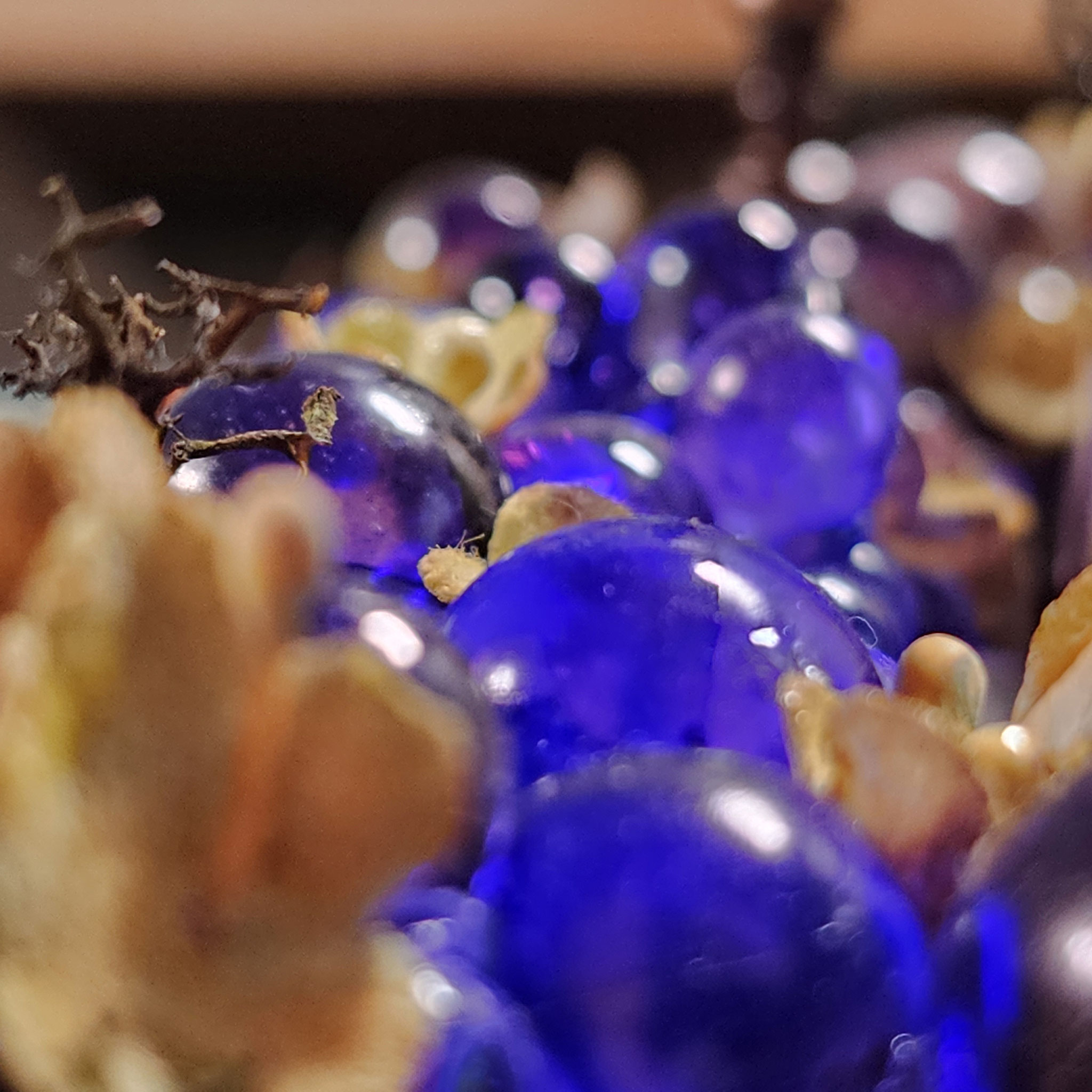
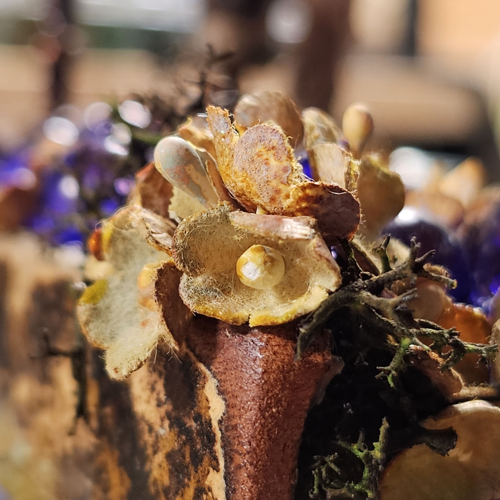
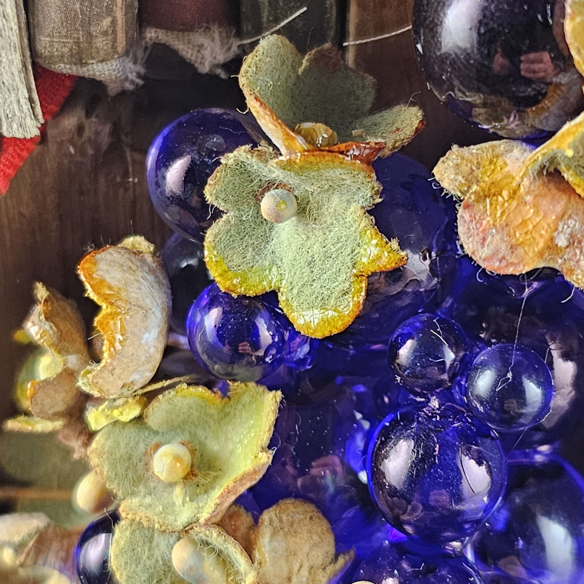
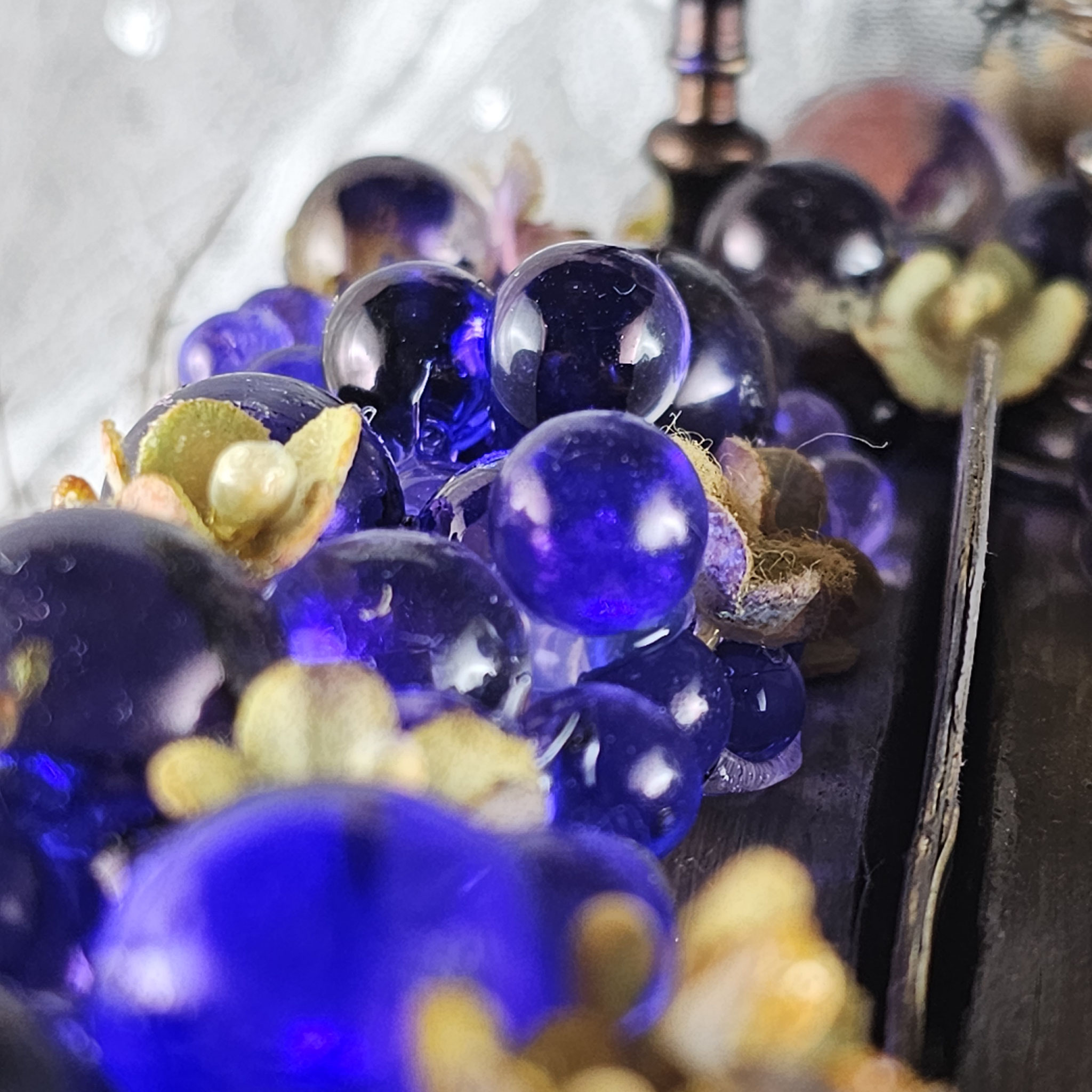
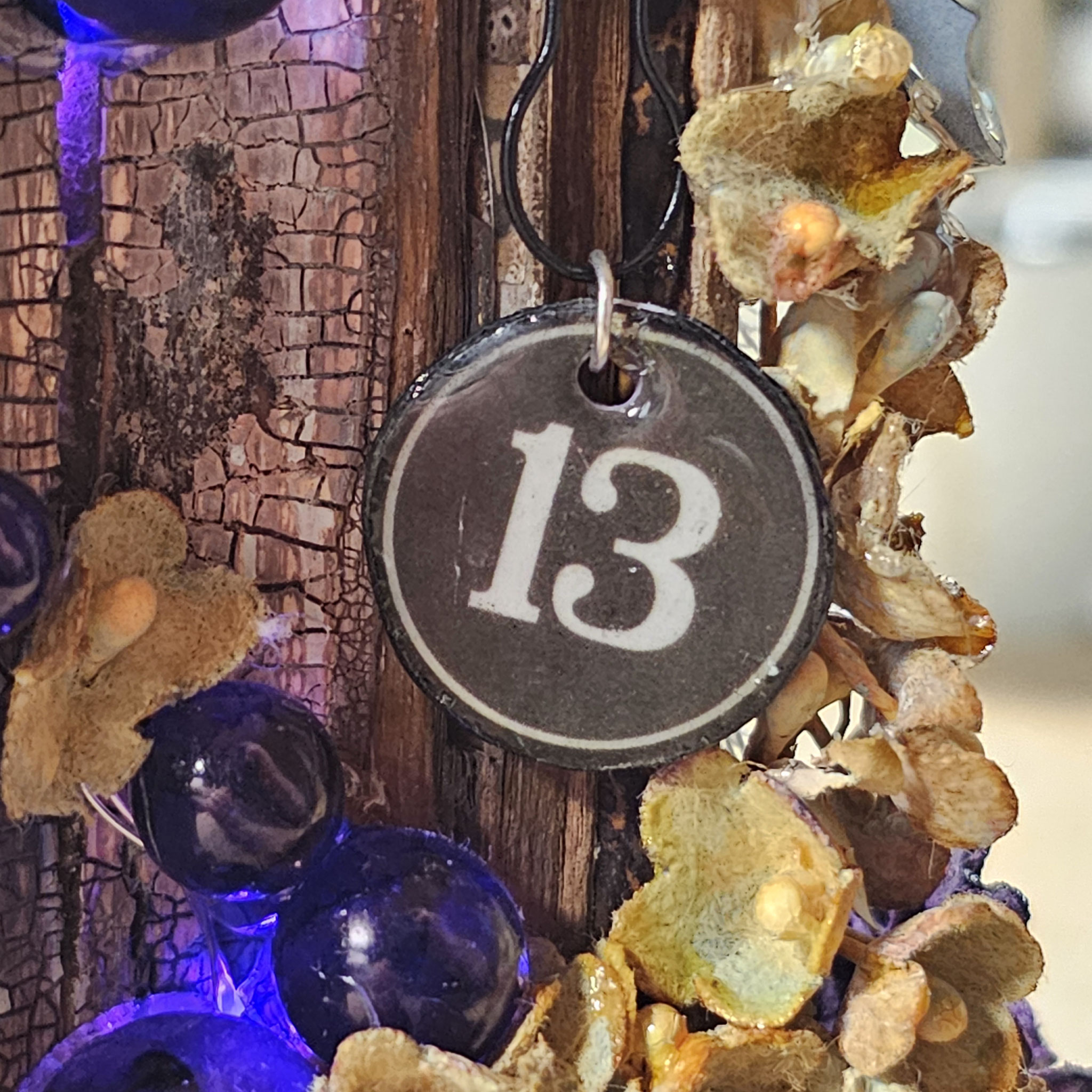
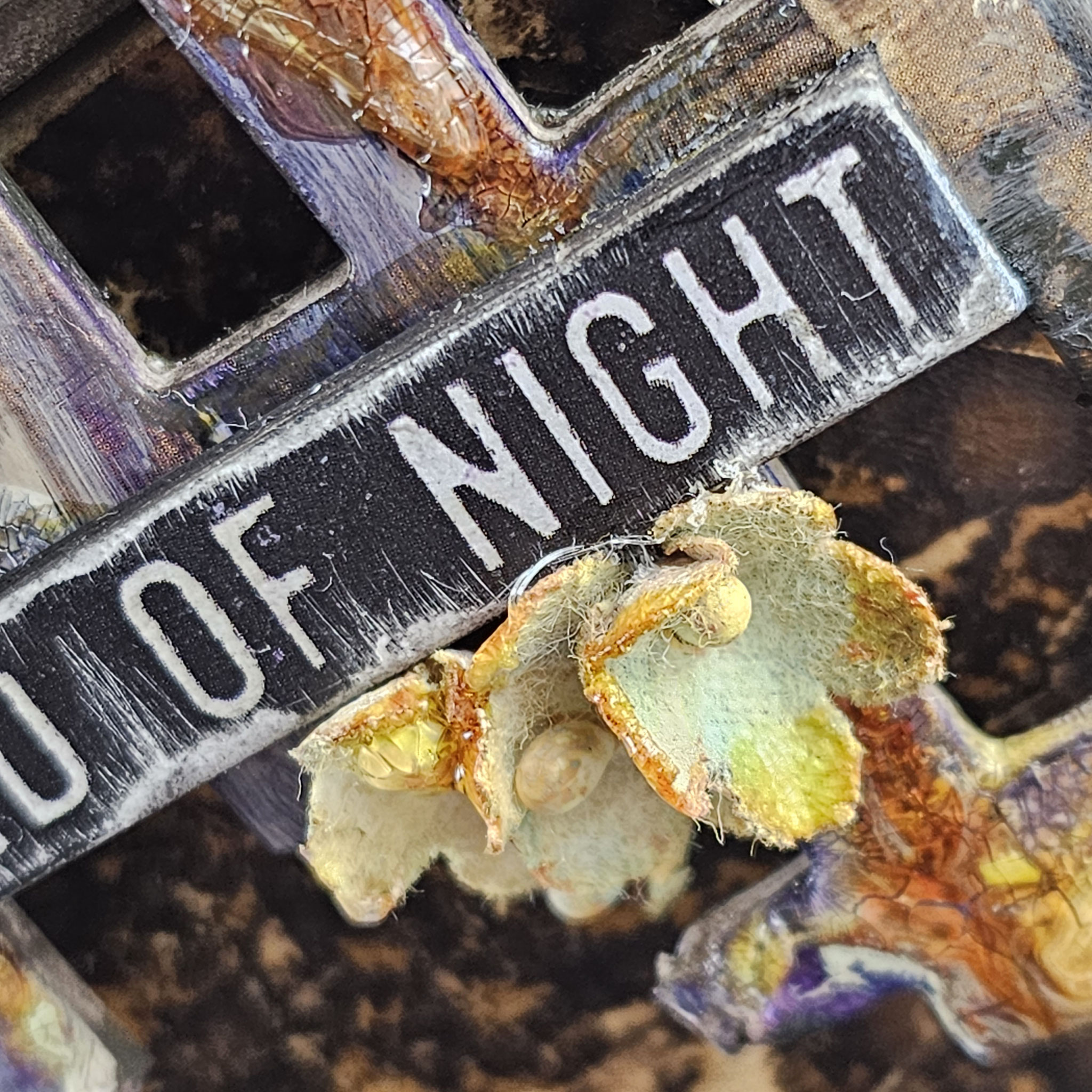
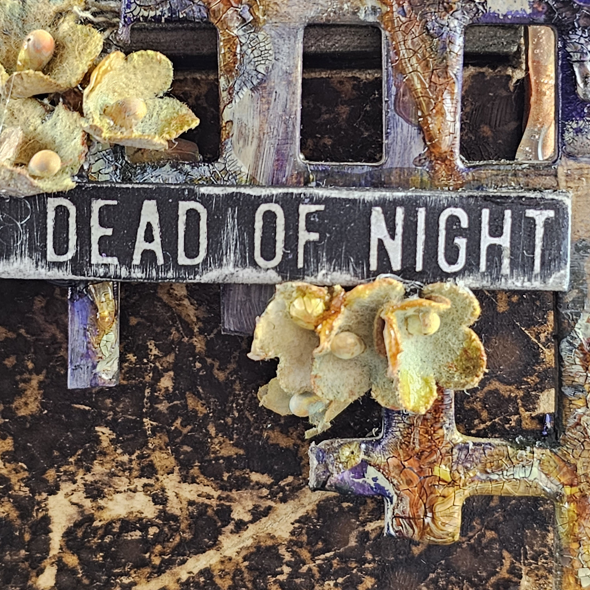
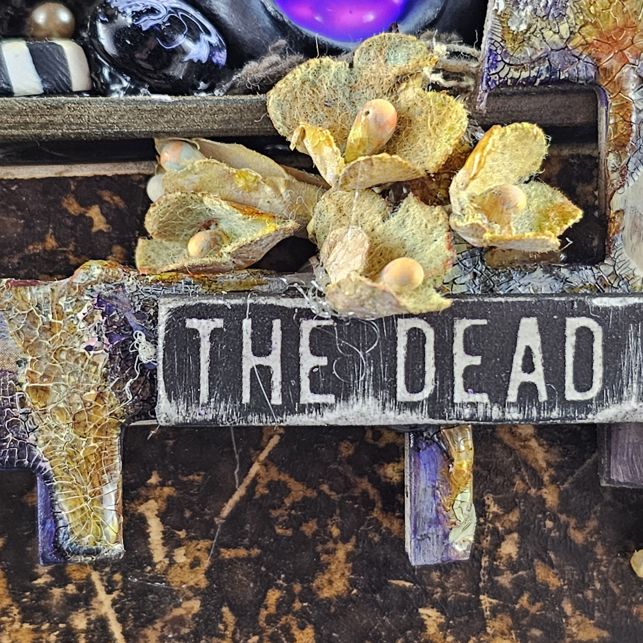
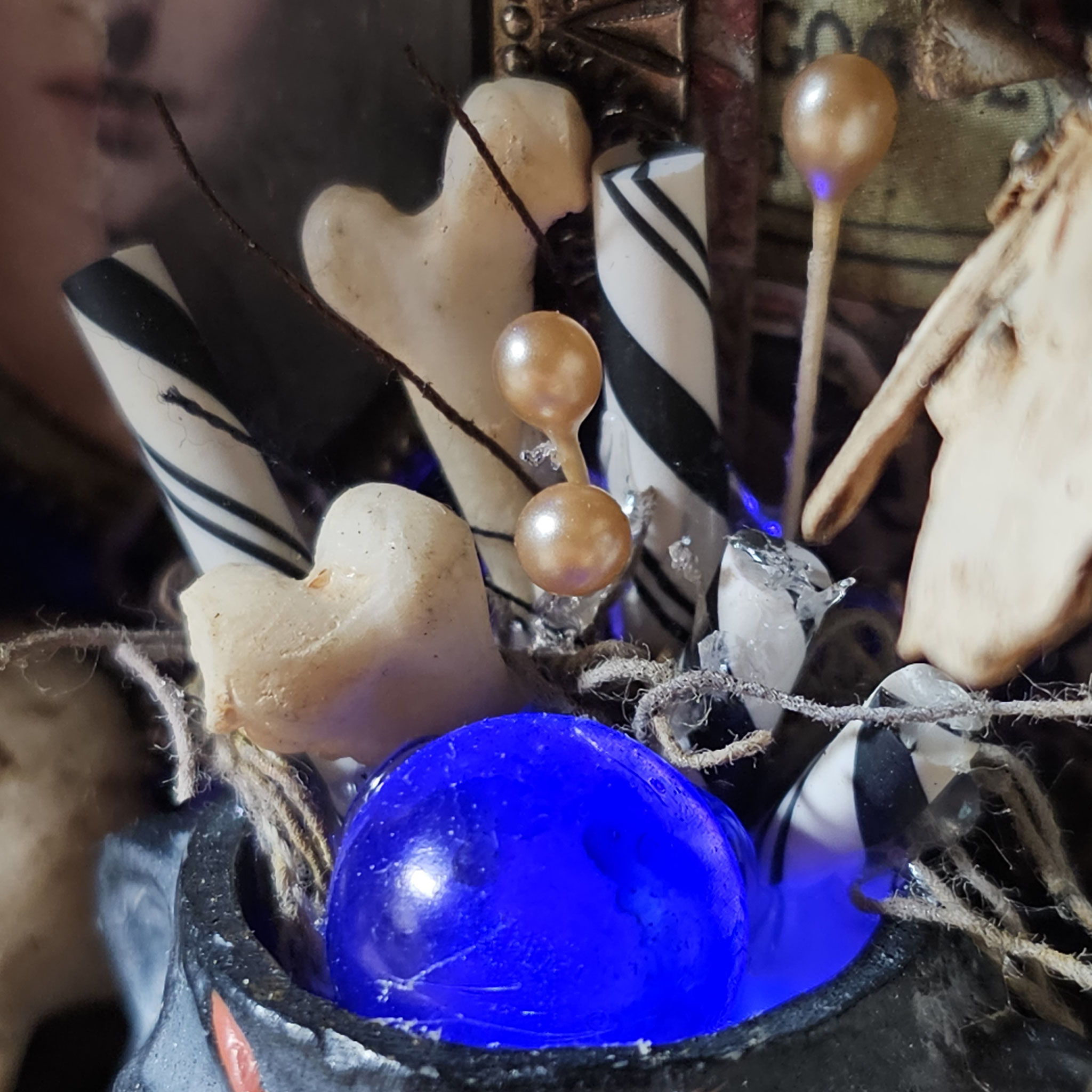
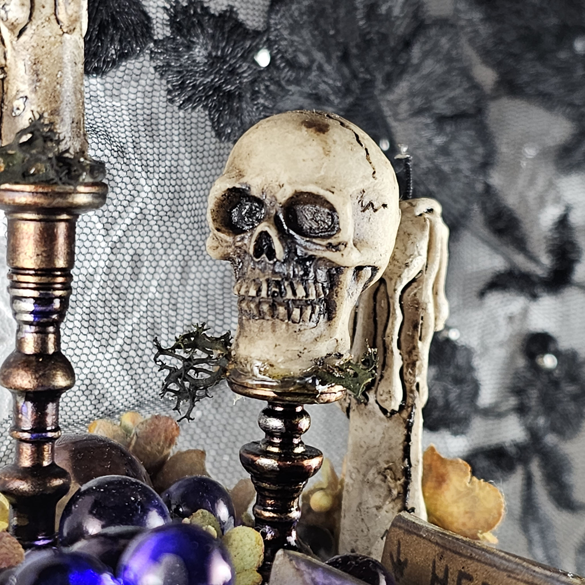
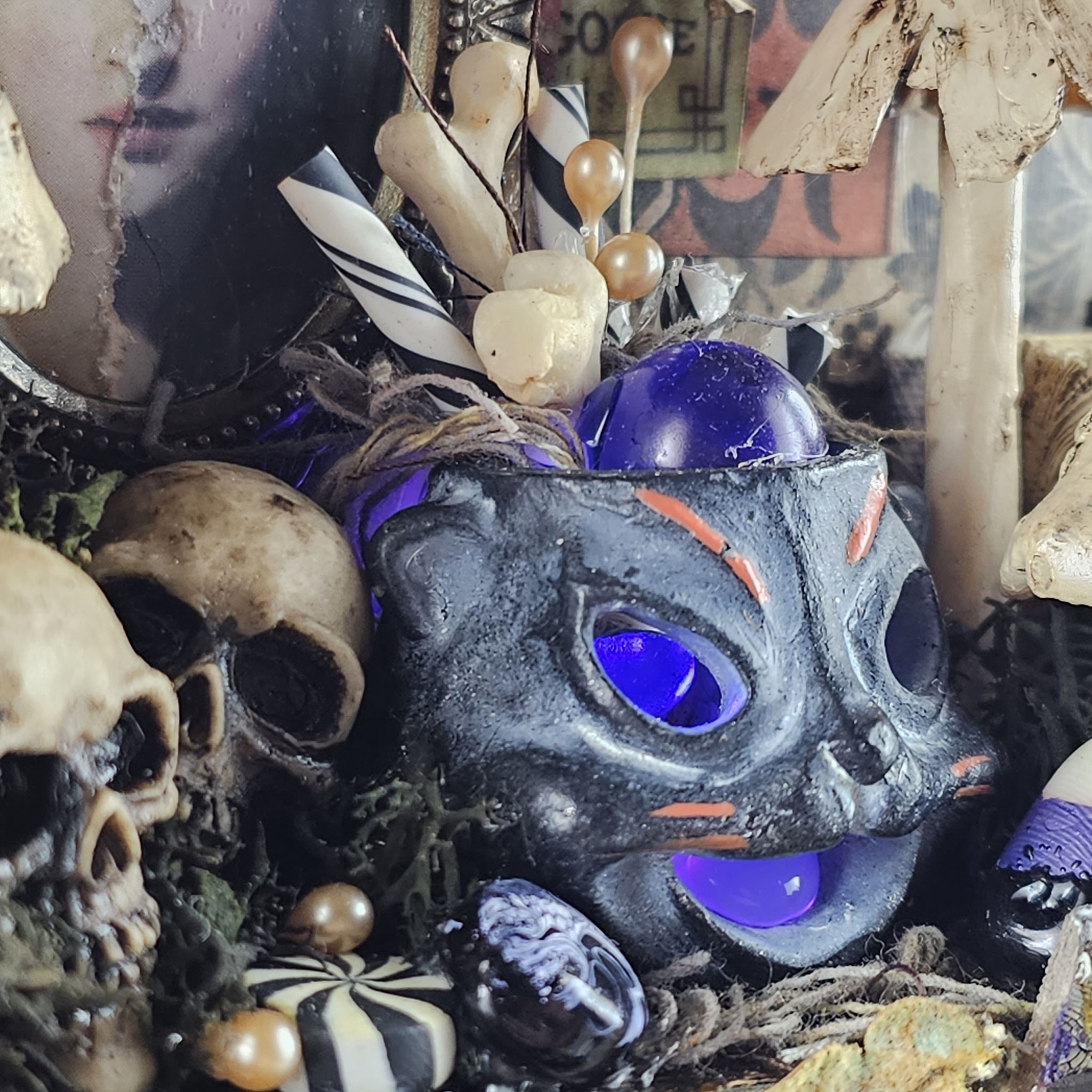
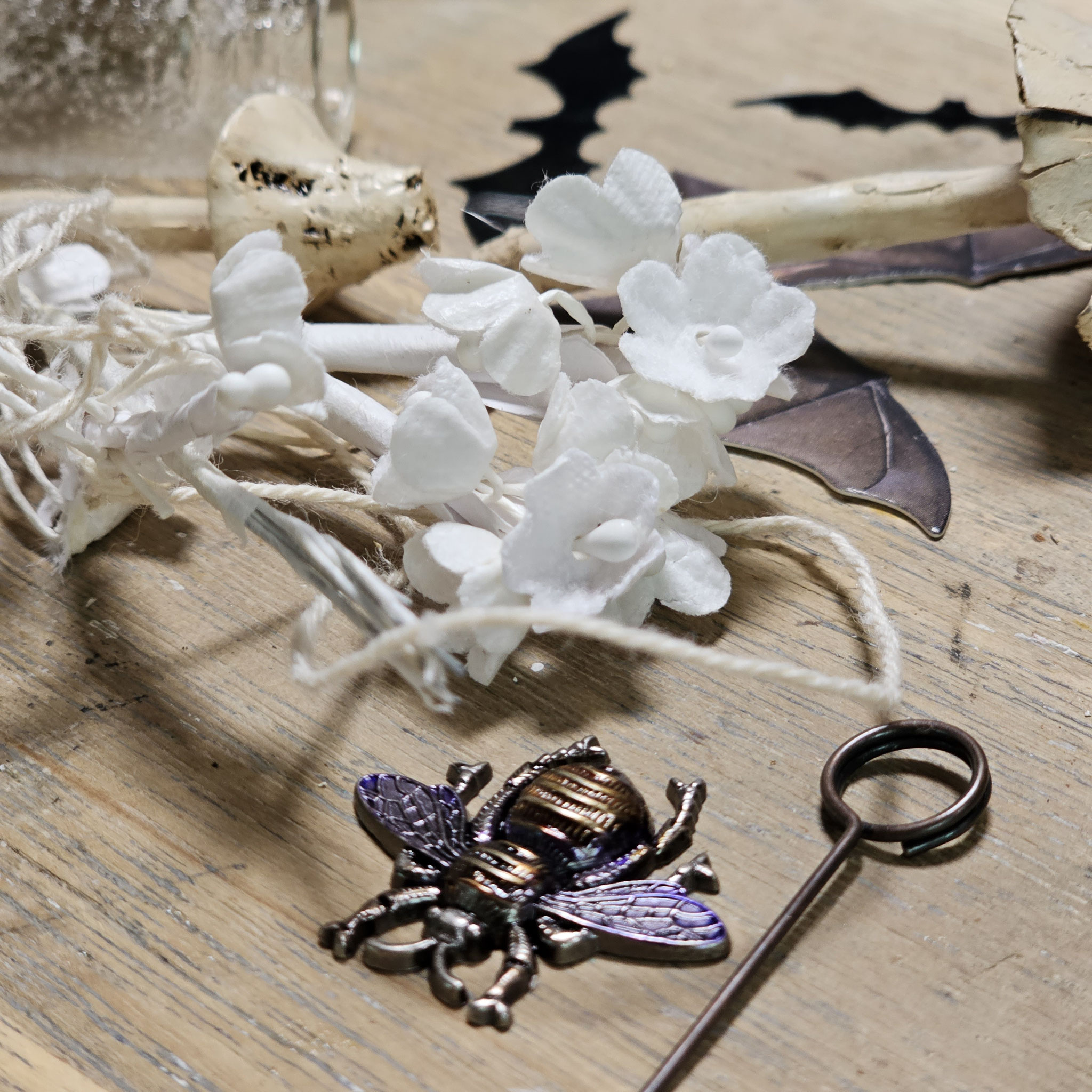
For coloring the purple bubbles I've used "amethyst" alcohol ink, the bouquet flowers I've sprayed with "brushed corduroy" distress oxide spray and then I've added a bit of distress crackle paint to get a nice color variation. To light up the bubbles I've used purple tiny lights.

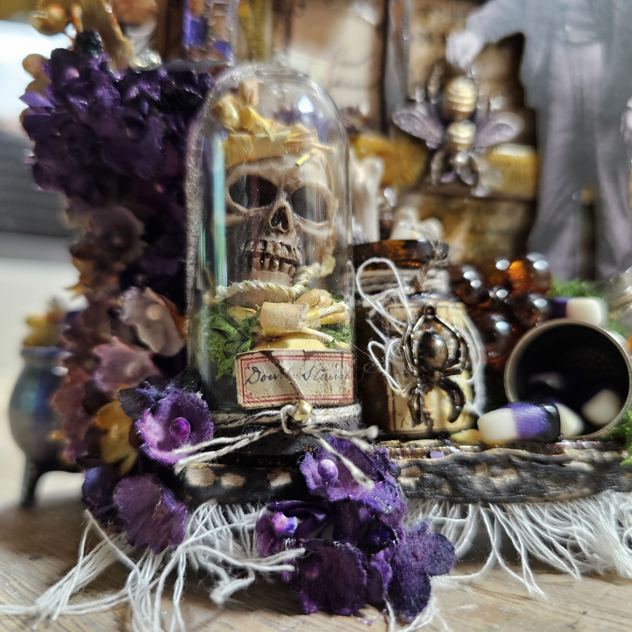
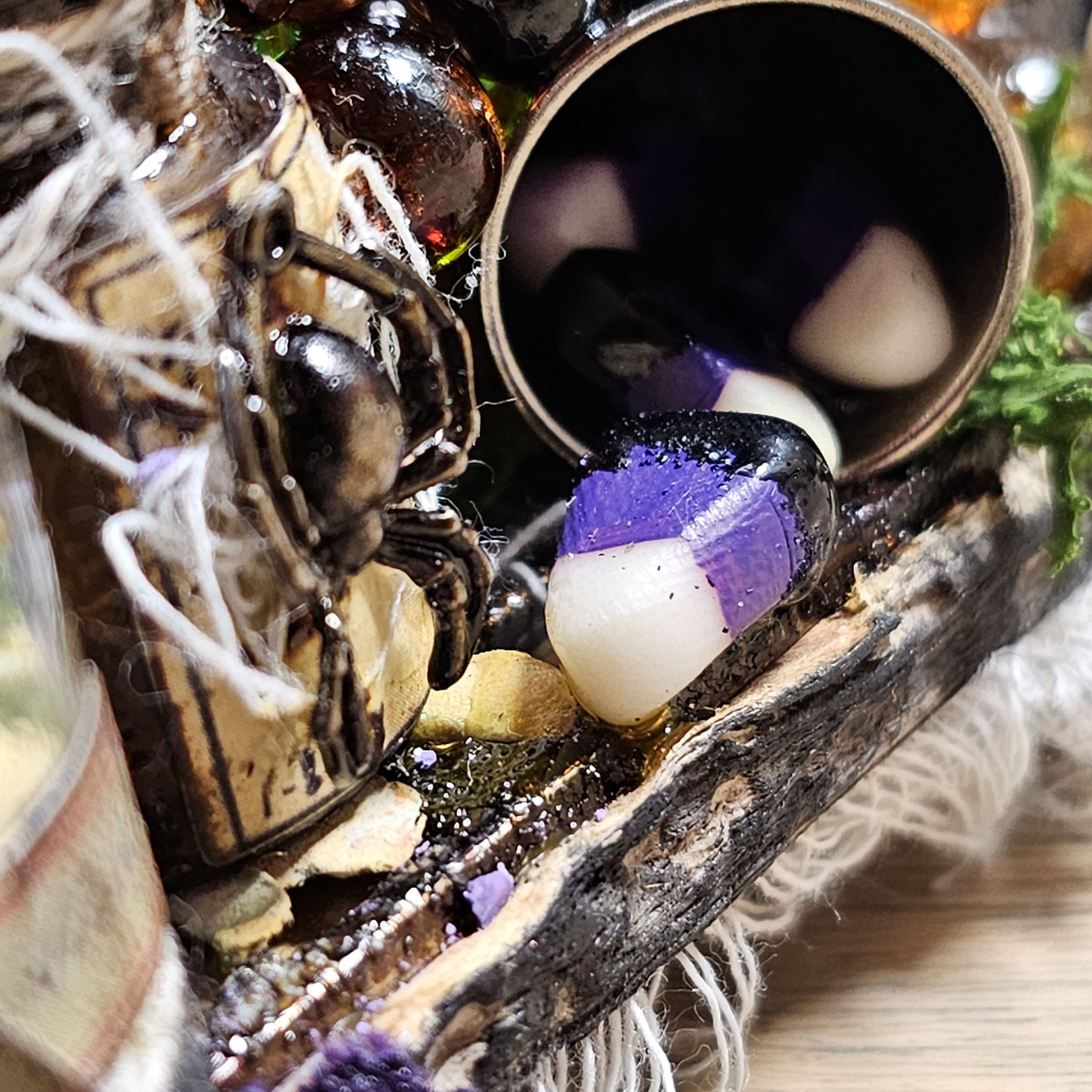
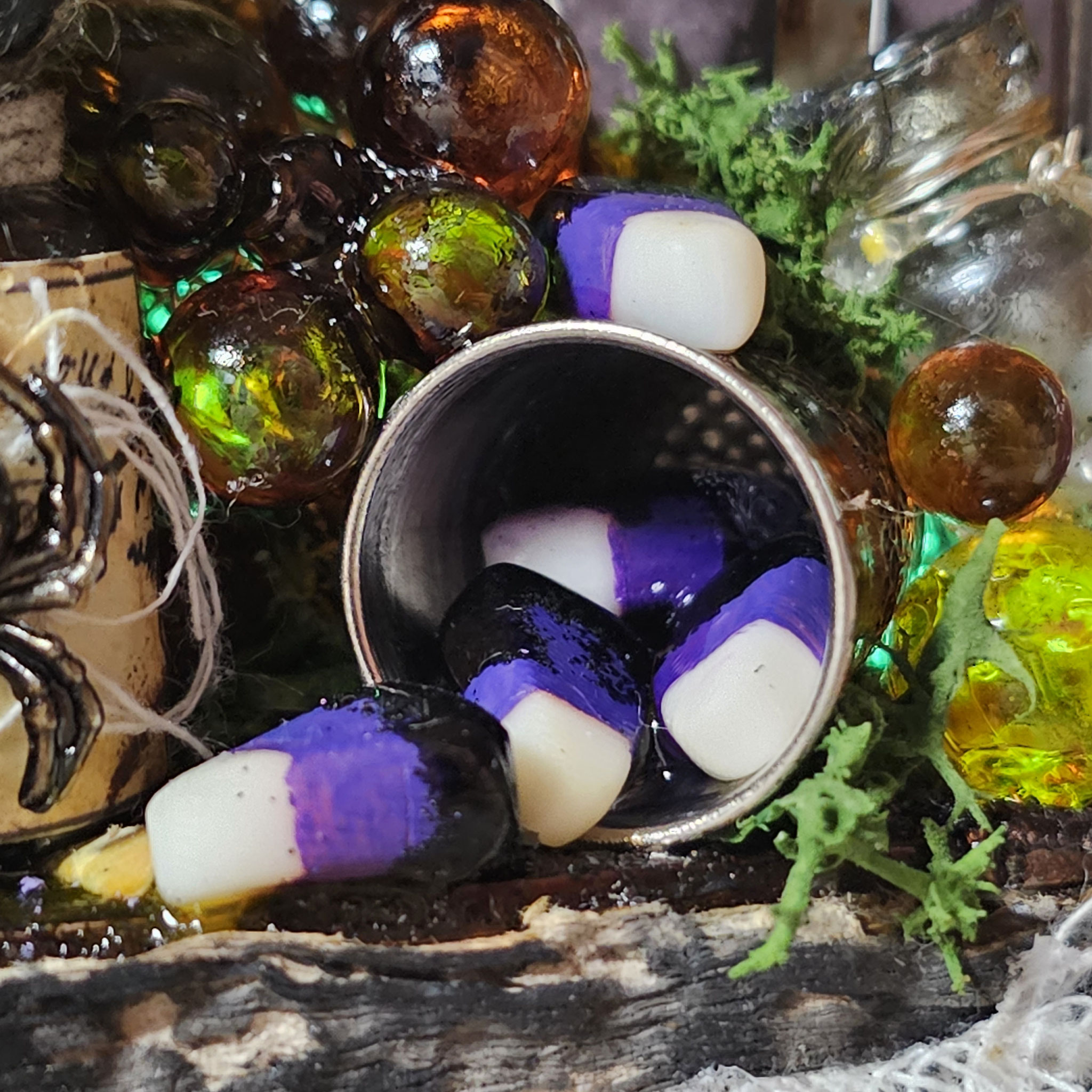
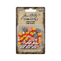
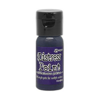
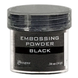
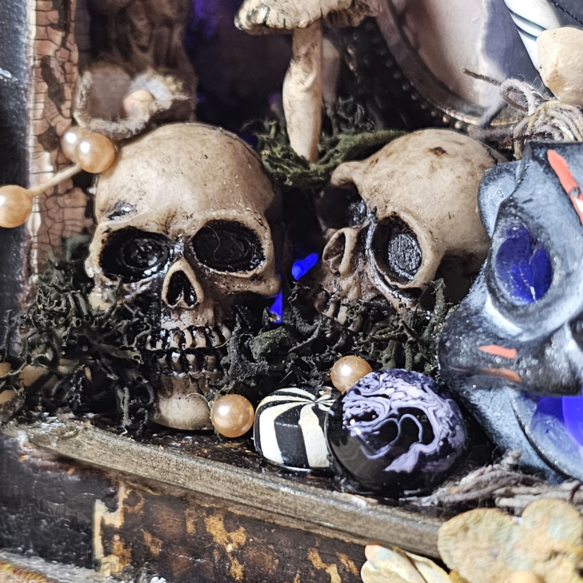
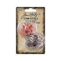
When I get creative with idea-ology candy corn I always immediately wanna have real candy :) For this make I changed the original colors (orange, yellow, white) to black, purple and white by painting and embossing the littly candy corns. For that I've used a mixture of villainous potion & wilted violet distress paint & black embossing powder. I've also tried out a marbeling technique with embossing powder on the round confections.

Just as Tim often says, "Wouldn't it be cool..."
That's precisely what I adore most about idea-ology. The possibility to change each piece just the way you want or need for your project. Some pieces might seem simple or not very exciting at first. But that's a fantastic opportunity! It's like having a blank piece of paper that you can fill with your own thoughts, your own dreams. And sometimes, you might be amazed at how perfectly this seemingly ordinary piece fits into your artwork.
As a junk journaler, I really adore the paper pieces, and I always try to find interesting and, most importantly, easy ways to achieve the style I want for my project. It's always surprising how many interesting paths you come across when you look beyond the usual and try a project that's not typical for junk journaling, like this one.
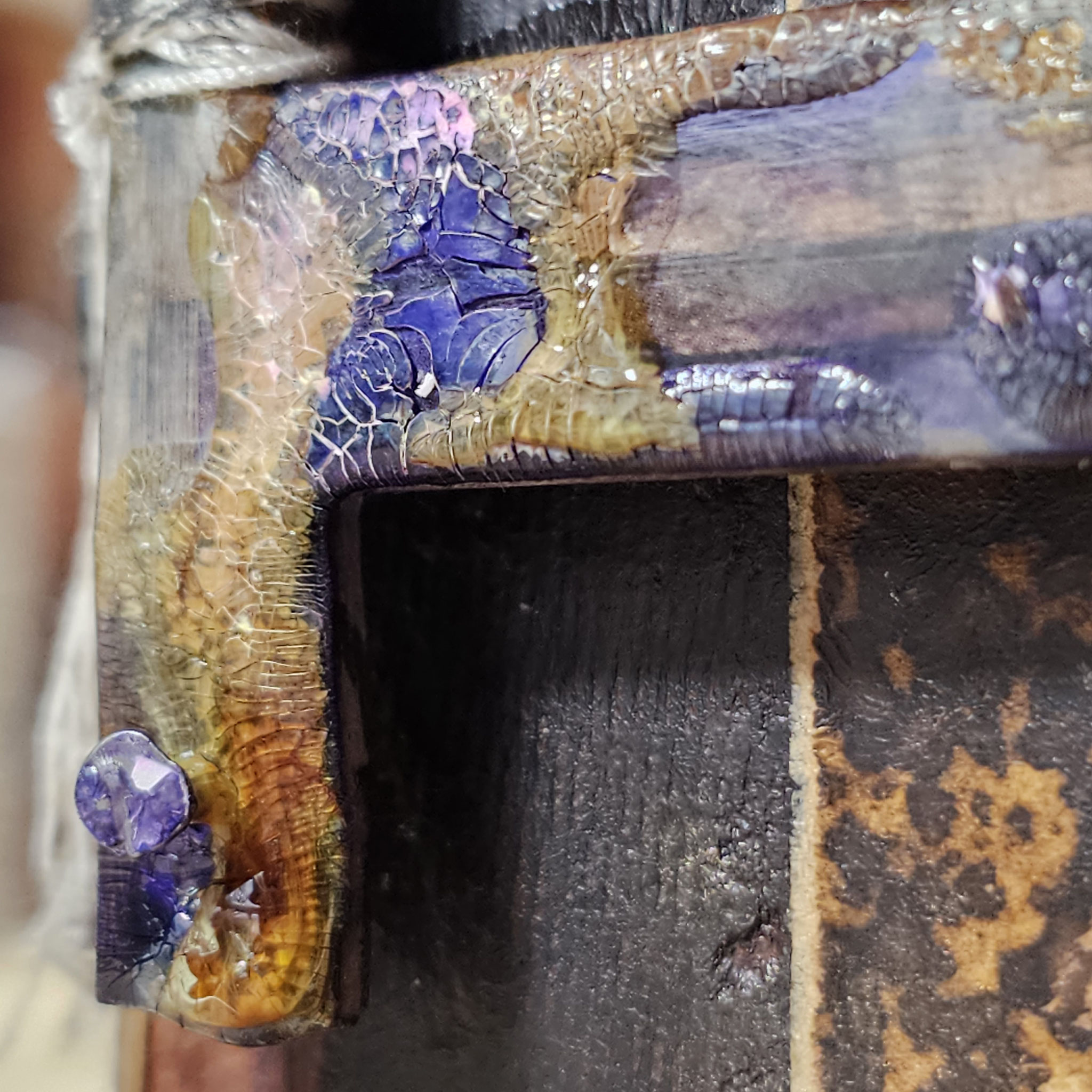
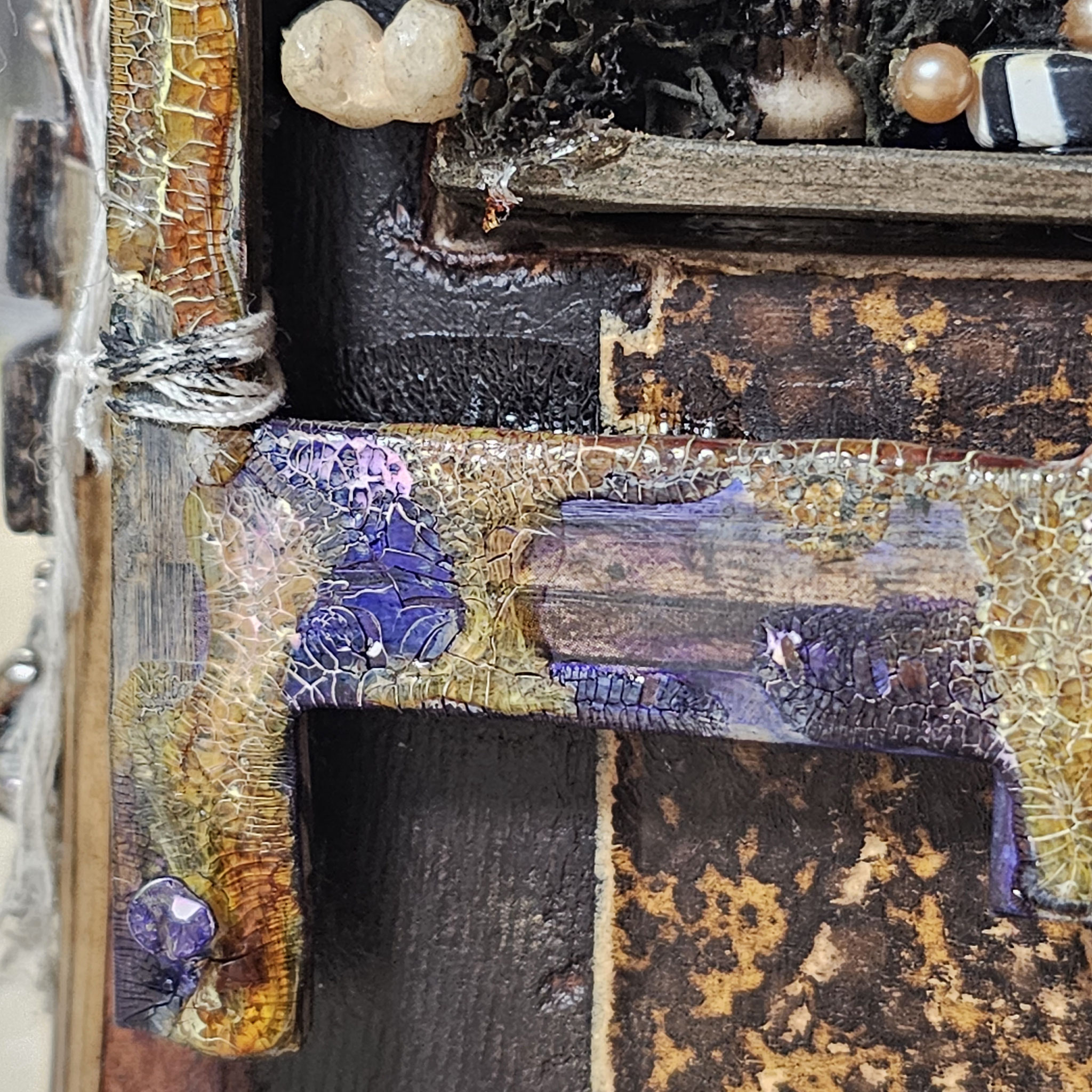
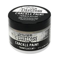
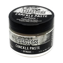
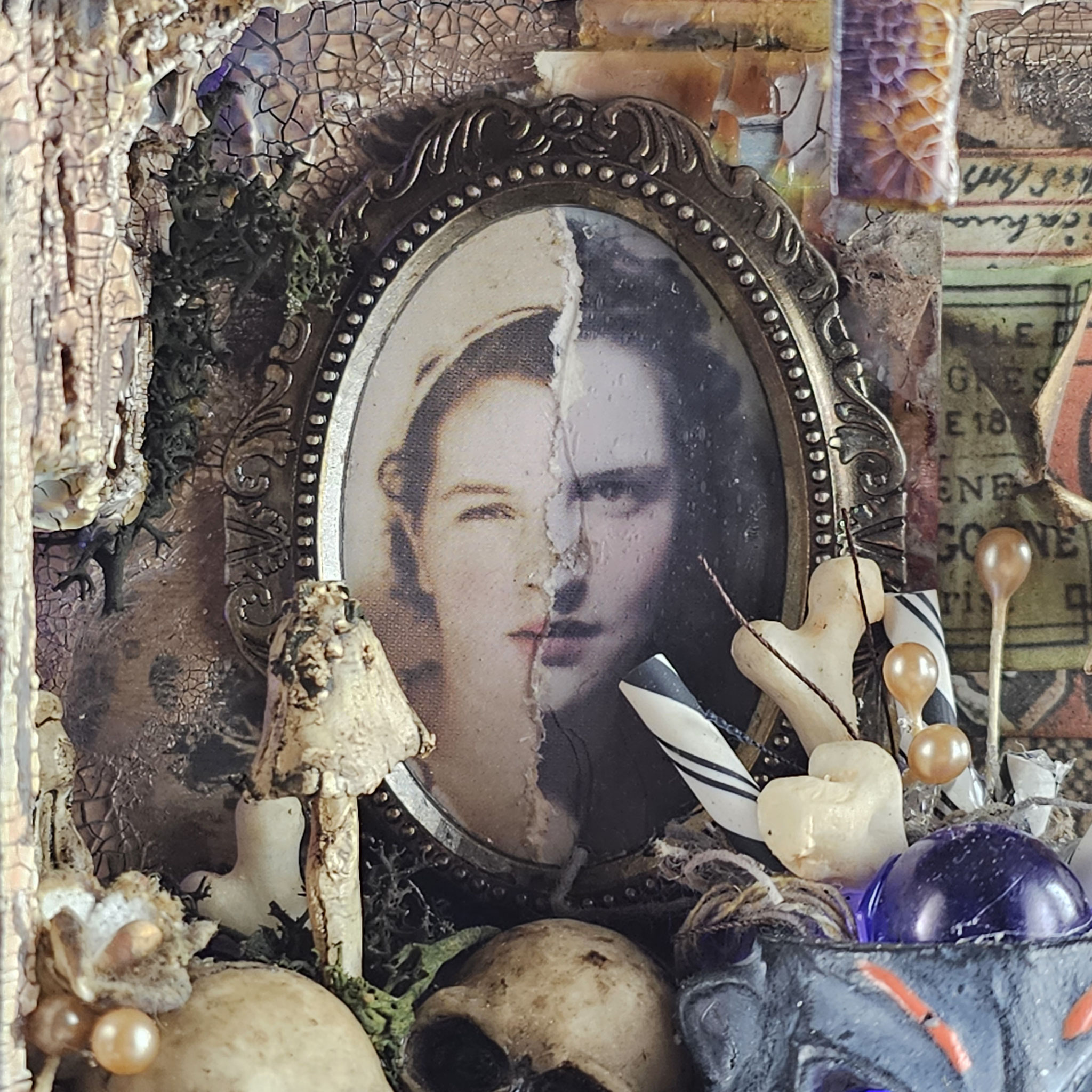
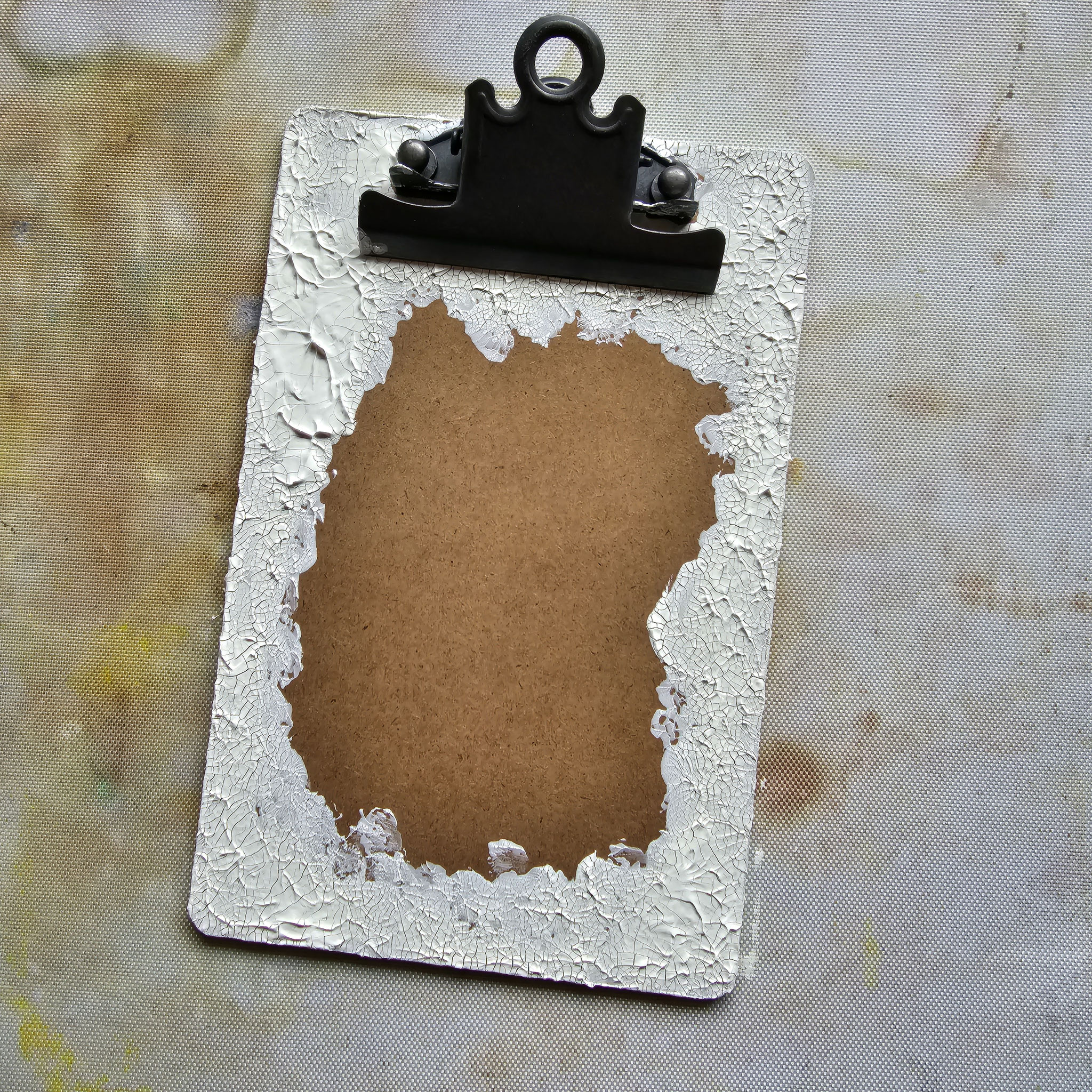
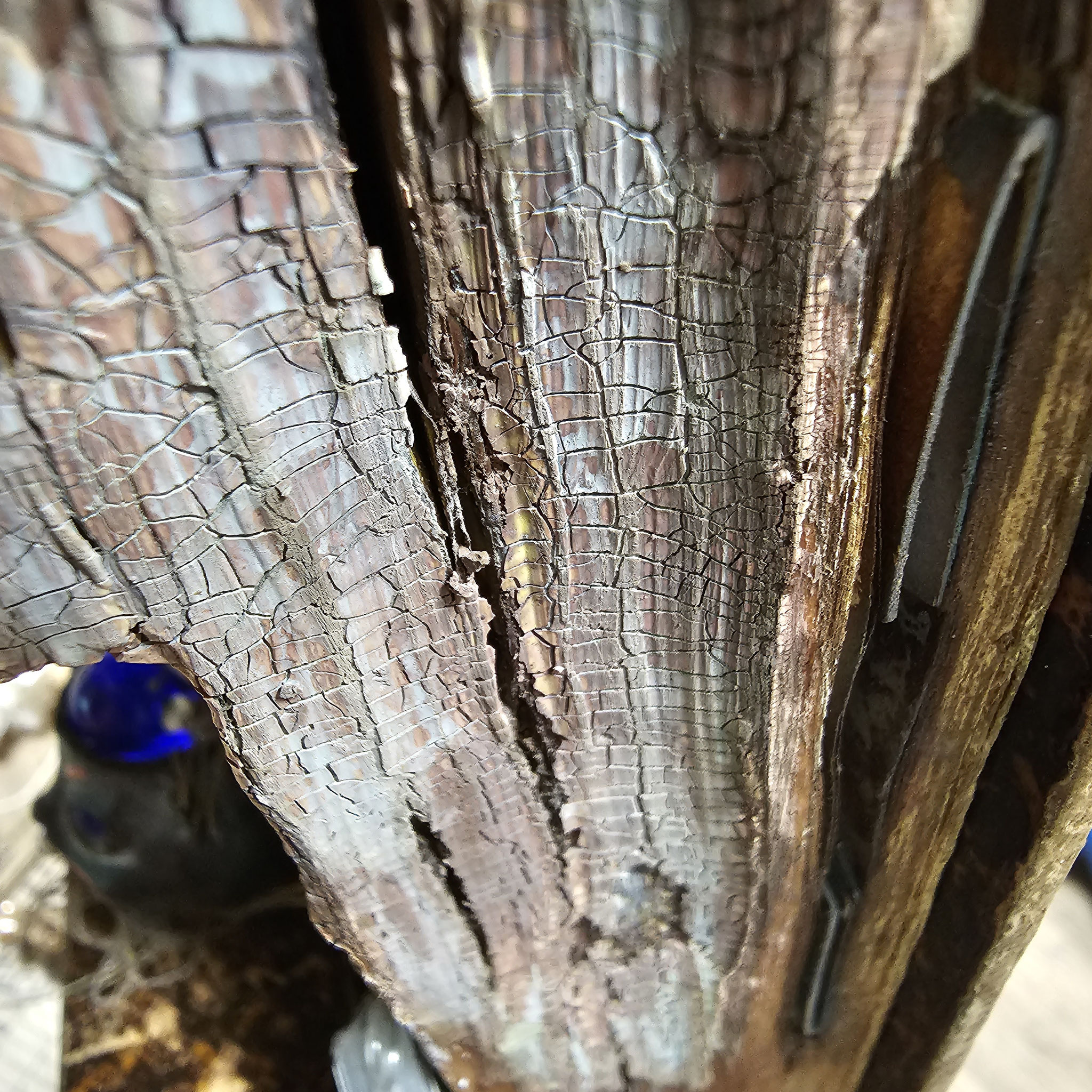
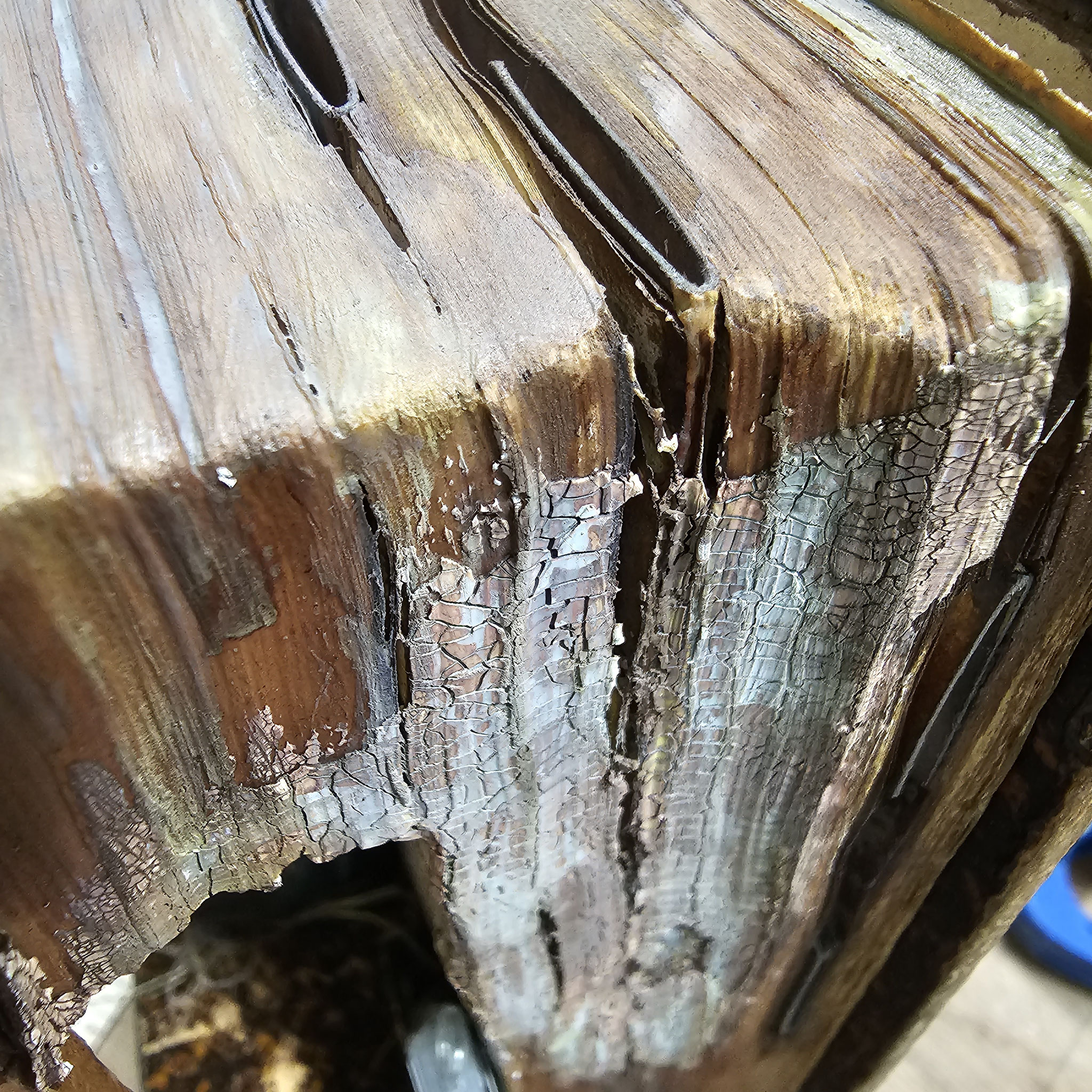
For the crackle effects on this project I've used distress crackle paint translucent and distress crackle paste opaque. After drying I colored the crackles with different mediums like alcohol ink and distress crayons.
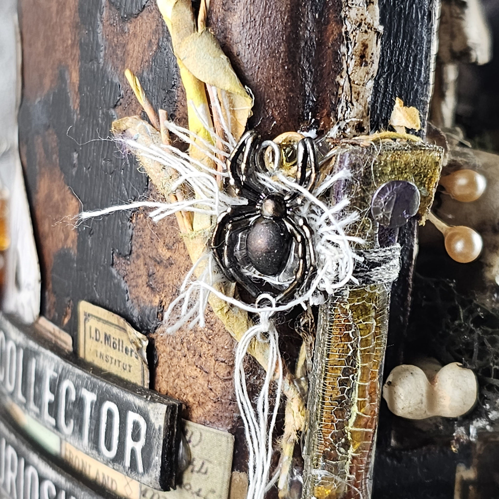
The distressing on the chipboard pieces was done with a sanding disk - love it!

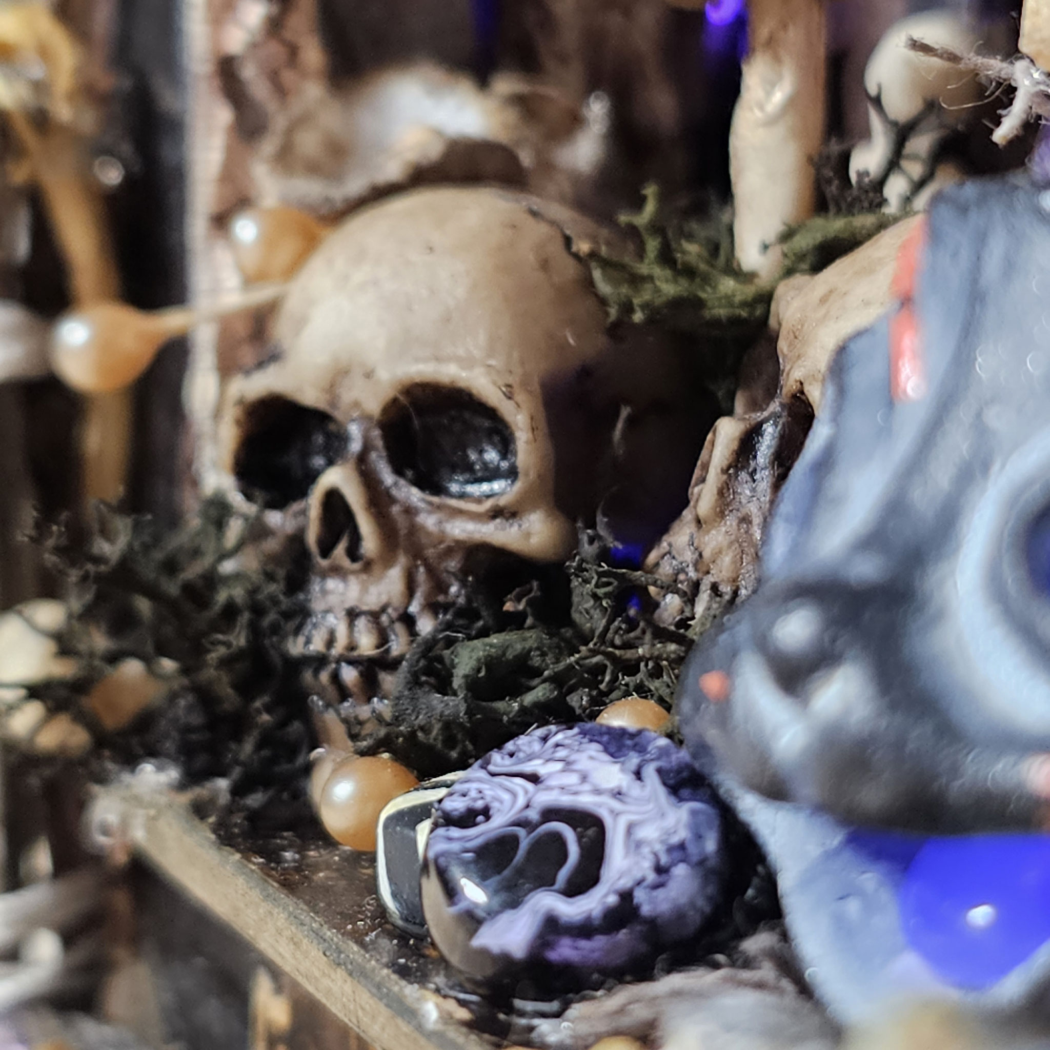
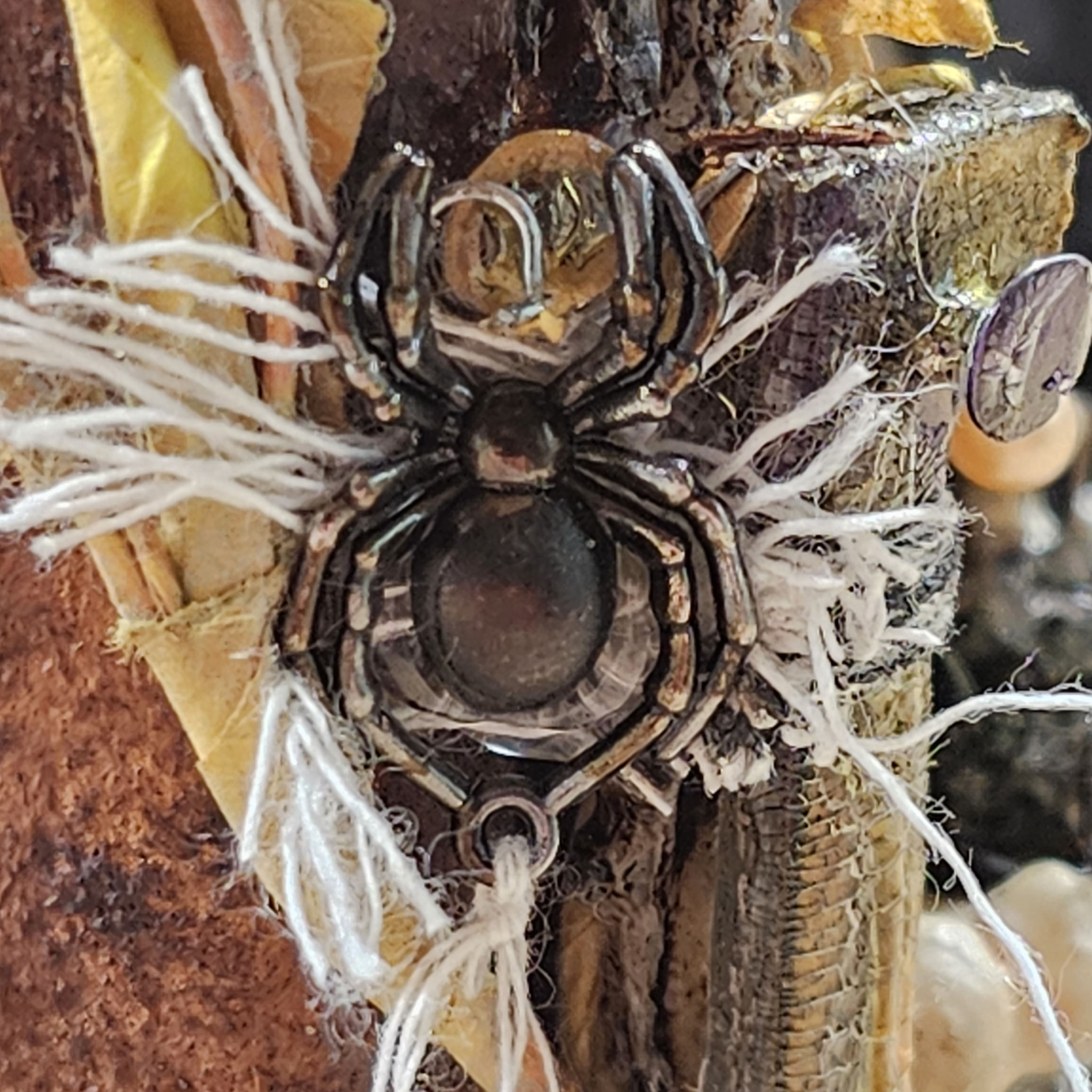
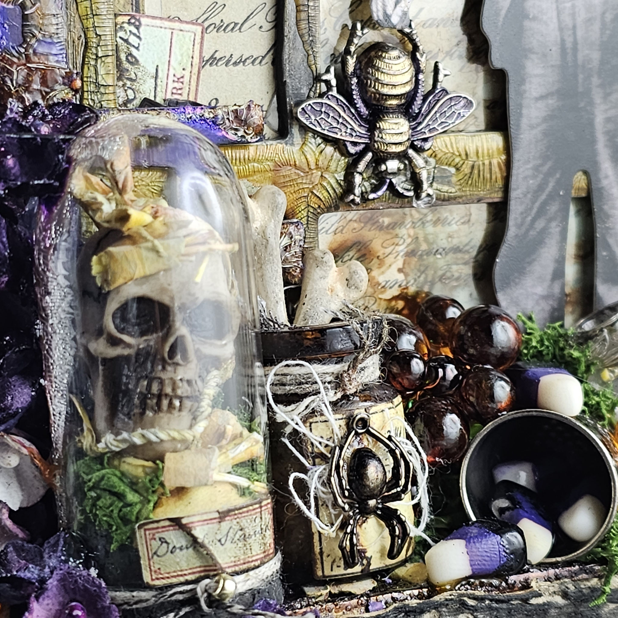
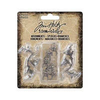
When I first held the skulls, bones, and spiders in my hands, I felt a shiver down my spine, if you want to know exactly. To be honest, I hate real-life spiders. But with idea-ology, you start to love the creepiest and grossest things all of a sudden. I never thought I would become such a Halloween enthusiast...
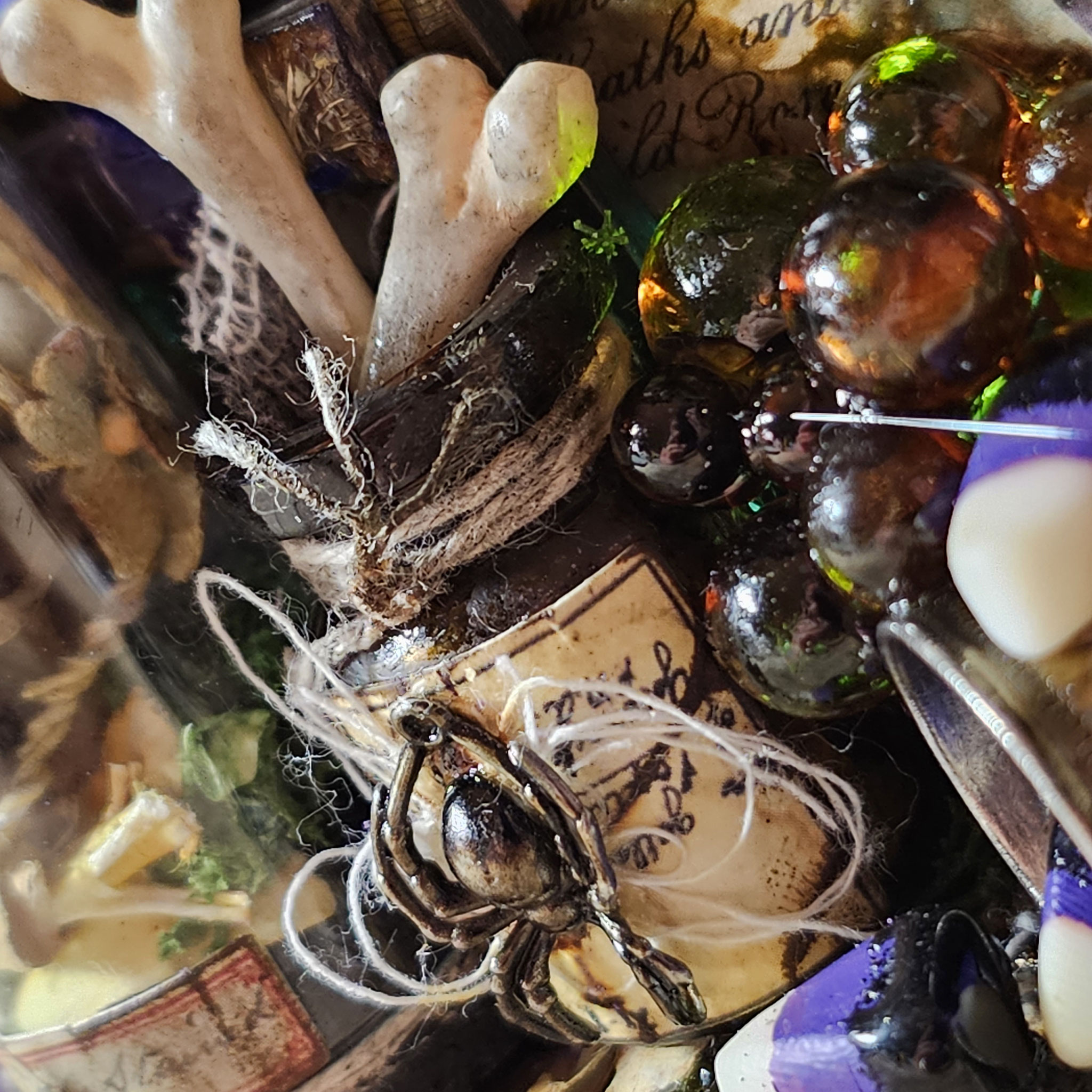
And as you can see, you don't need to alter every piece with mediums. For instance, I used the skulls and bones just as they came out of the package. They already have such an amazing look and such realistic details that you can use them as is.
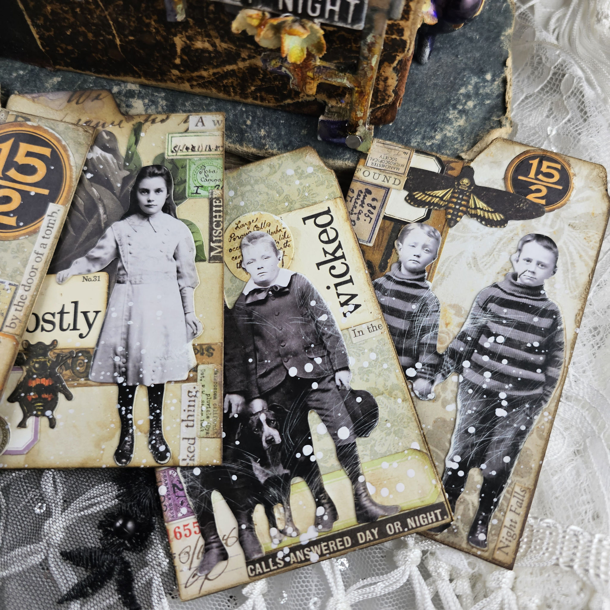
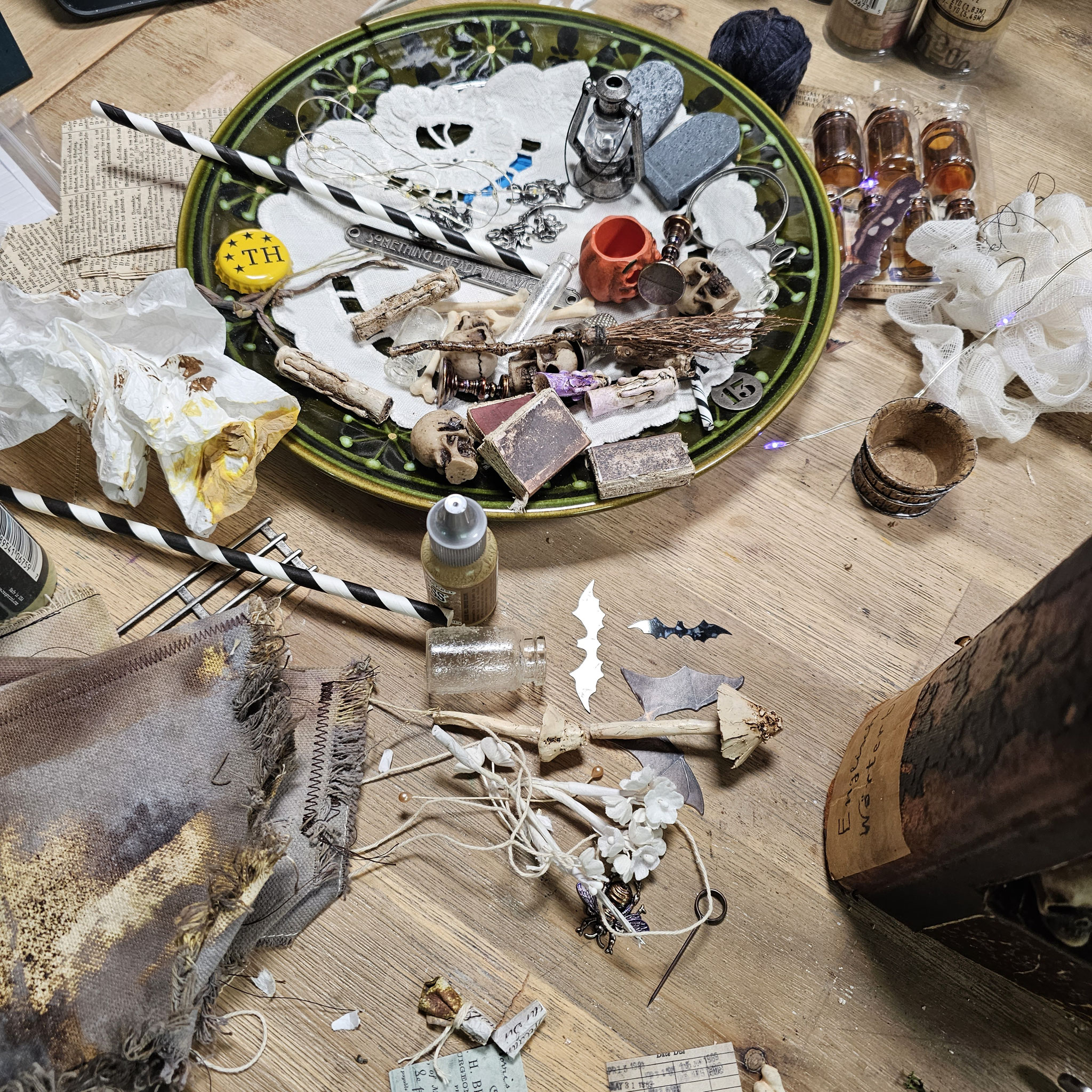
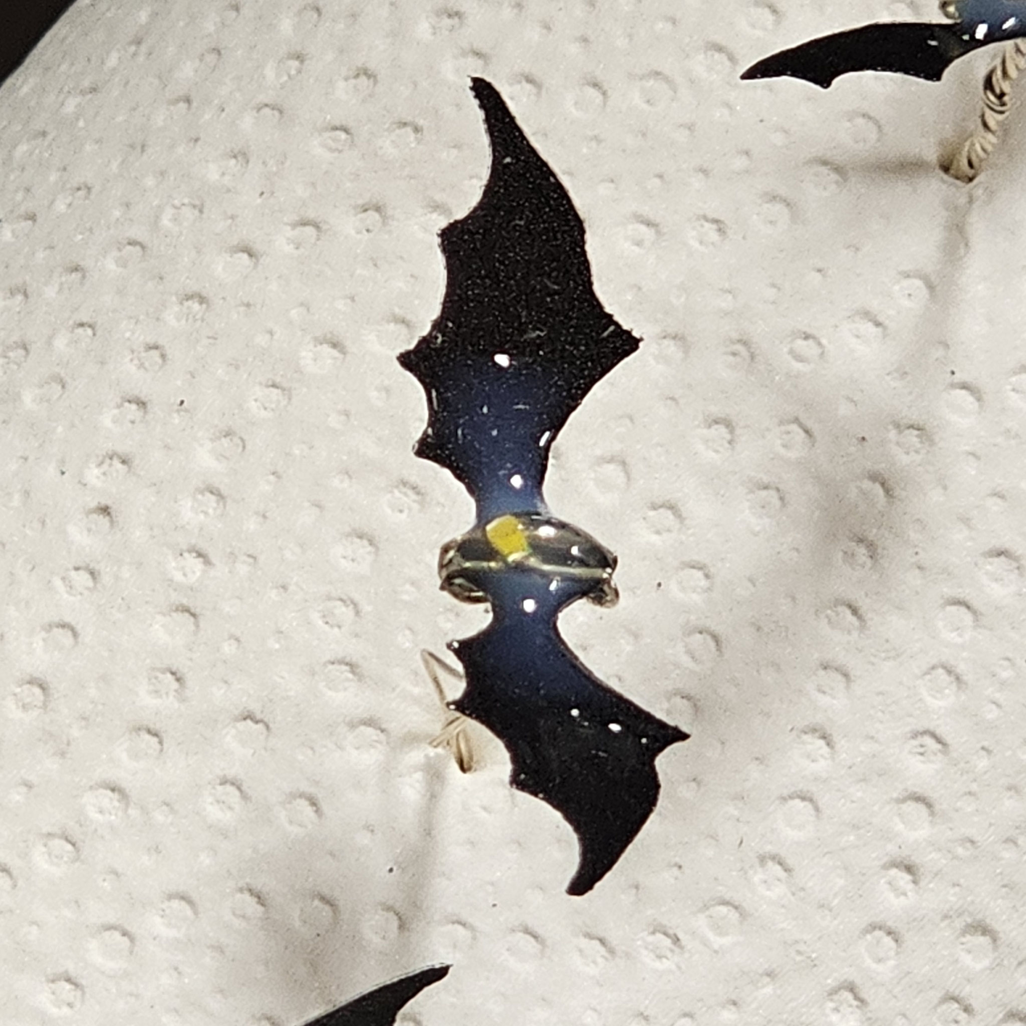
Behind the scenes of this project... Because I'm often asked about how it looks on my desk while working on a project I show you a glimpse behind the scenes here.
Did you notice the little detail on the bats stuck in my kitchen roll and drying? I wrapped their bodies with the remaining wire from my tiny lights. This makes them more three-dimensional, and it also gives you a way to make them fly by simply poking the wire into your project with some glue for better grip. One of the tiny light bulbs is placed on the bat's body, and the two ends of the wire are bent downwards and twisted together beneath the body. To keep the bulb in place, I also added some glossy accents on it. This also adds a cool dimensional effect at the same time.

Have any questions or just want to chat about it? Shoot me a comment or a message – I'm here and all ears!
Missed the inspiration filled live on Tim Holtz's youtube? Watch the replay here:


