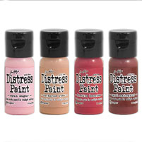
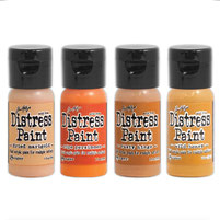
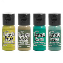
In 2012 Ranger retired a select palette of DISTRESS PAINT colors to make room for new distress products. With the continued success of all things distress, Ranger is releasing the first ever "BACK FROM THE VAULT" collection! Ranger has manufactured a limited production run of 20 retired distress paint colors giving makers the opportunity to stock up on your favorite distress paint colors before they go back in the vault.
(timholtz.com)
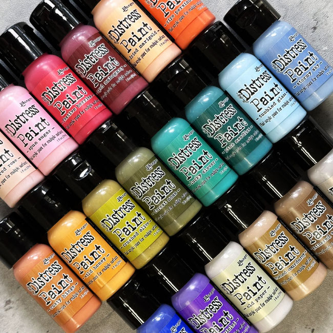
A dream came true! I could meet my friend Marlies @marlydesign in person here at my caravan in Tyrol, Austria! We had a fantastic, funny & creative time together! And we wanna share some moments with you!


With these digital photo montages, I aim to express my emotions for the distress colors. Draw inspiration from these images and allow them to ignite your creative spirit.
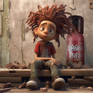
AGED MAHOGANY
a color that exudes elegance, richness, and a timeless allure. This deep, warm hue evokes a sense of history and craftsmanship, reminiscent of antique furniture and well-preserved heirlooms. The name itself conjures images of vintage libraries, with shelves lined with leather-bound books, and the lingering aroma of old pages.
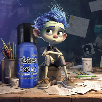
BLUEPRINT SKETCH
Ah, blue – a color that has never quite captured my heart... until I met "BLUEPRINT SKETCH". This captivating hue has transformed my perception and become one of my absolute favorites. Its depth and vibrancy ignite my creativity, allowing me to explore new artistic horizons with a sense of excitement. It's amazing how a single shade can change everything, opening up a world of inspiration and making my creative journey truly delightful.
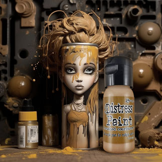
BRUSHED CORDUROY
This color is a favorite on a daily basis!
It evokes feelings of snuggling up in a soft, warm garment, perfect for chilly weather or cozy evenings. It's timeless, a bit retro & vintage with a nostalgic aesthetic.
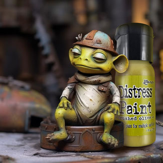
CRUSHED OLIVE
CRUSHED OLIVE is such a stunning color with a vibrant yet soothing energy and versatile possibilities. Whether you're embellishing a journal, creating a masterpiece, or simply adding a pop of color to your projects, let CRUSHED OLIVE spark your creativity.
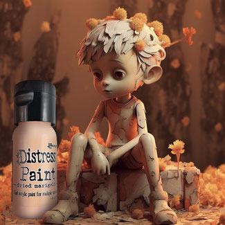
DRIED MARIGOLD
Each fragile petal carries a story, etched in the creases and folds that mark its journey. Memories of vibrant gardens, where marigolds danced in the breeze, flood the senses. Their vivid orange and golden hues radiated hope and joy, casting a spell of enchantment upon all who beheld them.
Now, in their dried state, these marigolds evoke a bittersweet melancholy, reminding us of fleeting beauty and the transient nature of life. Yet, there is a profound beauty that arises from their delicate fragility. Like a wistful melody, they stir the depths of our souls, awakening emotions we thought long forgotten.
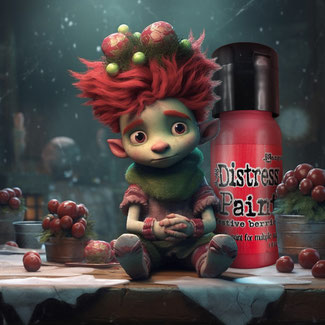
FESTIVE BERRIES
It embodies the holiday spirit, evoking the scent of Christmas in a single brushstroke. Celebrate the season with this vibrant color that sparks joy and nostalgia in every creation.
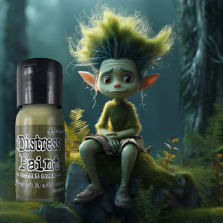
FOREST MOSS
Those who know me well know that I jumped for joy when this color came back from the vault! YEAH! I could paint my walls with it, bathe in it, and even spread it on my bread - that's how much I love it.
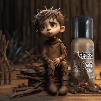
GATHERED TWIGS
Even as a child, I loved collecting small twigs and other treasures during walks. "GATHERED TWIGS" brings back all those memories, reminding me that you're never too old for such simple pleasures.
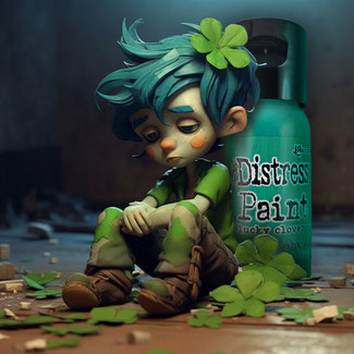
LUCKY CLOVER
This color feels like sitting in lush green fields and meadows where clovers grow abundantly. It's like finding a four-leaf clover in unexpected places. It evokes feelings of optimism and positive energy and the belief of finding one's own lucky path or seizing opportunities in life.
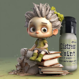
OLD PAPER
Using this color feels like a journey through time. Layers of history unfold, revealing tales untold and whispers of the past. It evokes memories of handwritten letters, faded photographs, and treasured keepsakes. Embrace the beauty of imperfection!
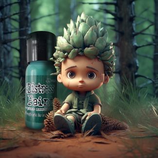
PINE NEEDLES
This color transports you to a world of serenity. It reminds of crisp forest air and the gentle rustle of pine needles underfoot. It inspires a connection to nature, evoking a feeling of groundedness and harmony.
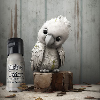
PUMICE STONE
I can't comprehend how one can develop such a shade. Pumice stone is the warmest gray I have ever seen. It reminds me of porous lava rocks. This color makes every project unique! And, in fact, you can even learn from it. Did you know that the sulphur-crested cockatoo is known to inhabit volcanic regions? It adapts to various habitats, including volcanic landscapes with open forests and woodlands. Interesting, isn't it? But why on earth does its plumage match the color "pumice stone" so well?
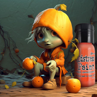
RIPE PERSIMMON
I absolutely love ripe persimmons! They give me the feeling of being on vacation every time. And that's exactly how it feels when I use the color in my projects. Loooove, love, love!

RUSTY HINGE
No matter what you paint with this gorgeous color you'll discover fragments waiting to be woven together, like pieces of a forgotten puzzle. Explore the untapped potential that lies within the layers of rust & let them become part of your projects.
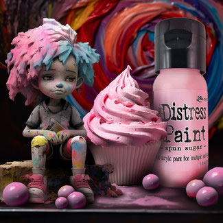
SPUN SUGAR
It's like capturing the essence of a sweet, cotton candy-filled dream. When using this color for my projects, I have to constantly be careful not to lick it because it looks irresistibly sweet. At the same time it's creating a calming effect that soothes the soul.
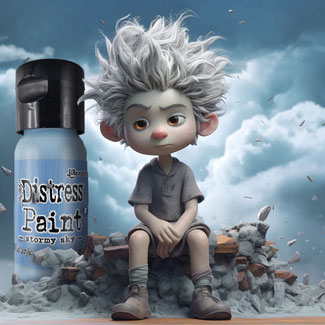
STORMY SKY
Hold on tight! Don't be surprised if you find your journal pages soaring through the clouds or your cards performing acrobatic stunts in the sky. Remember to anchor down your paper crafts or be prepared for an unexpected airborne adventure. Happy crafting, and may the winds of inspiration carry you to artistic wonders!
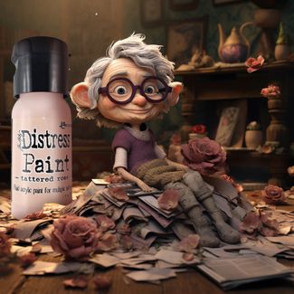
TATTERED ROSE
The tattered rose tells a story of love and loss, of fragility and resilience. Its once-vibrant petals, now faded and torn, hold a whispered echo of past enchantment. Each delicate fold and crease carries the imprints of a thousand caresses, a testament to the emotions it once stirred.
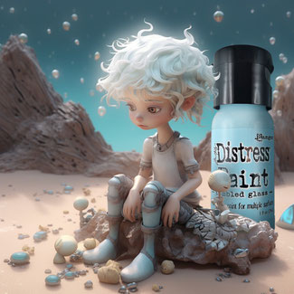
TUMBLED GLASS
This color evokes childhood memories. Many times have I strolled along the beach next to the camp site in Italy, searching for little, special treasures. This blue carries the essence of sun, summer, and freedom!
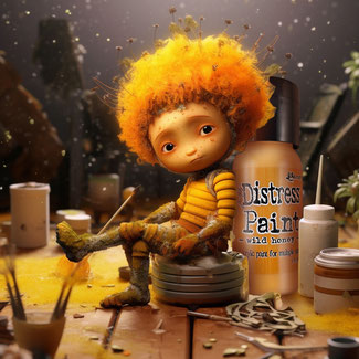
WILD HONEY
This is a very special one!
Whenever I hold this color in my hand, it reminds me of my sweet friend Hanni @honey_loves_paper. Not only does the color name "wild honey" evoke memories of her, but she is just like this color. Wild, vibrant, with a generous dose of sunshine in her heart, and incredibly sweet.
With this digital photo montage, I aim to express my emotions for this distress color. Draw inspiration from this image and allow it to ignite your creative spirit. You can find a color swatch on the second image to envision how it can look on your project.
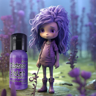
WILTED VIOLET
In the dim light of a forgotten corner, a wilted violet stands alone, its once vibrant petals now drooping and weary. Like a fragile soul weathered by the storms of life, it carries an air of melancholy and resilience.

